The Ultimate Website Audit Checklist: 10 Essential Checks for 2026

Sidharth Nayyar
TL;DR: This website audit checklist provides 10 essential checks to improve your site's accessibility, SEO, and user experience. Key actions include:
Keyboard Navigation: Ensure your site is fully usable with only a keyboard.
Screen Reader Compatibility: Test with tools like NVDA/JAWS to make content accessible to visually impaired users.
Color Contrast: Verify text is readable (4.5:1 ratio minimum).
Alt Text: Write descriptive alt text for all meaningful images.
Form Accessibility: Label all fields and provide clear error messages.
Heading Structure: Use a logical
H1 -> H2 -> H3hierarchy.Mobile Accessibility: Confirm usability on small screens with large touch targets.
Multimedia Captioning: Add captions and transcripts to all videos.
Link Text Clarity: Use descriptive links instead of "click here."
Legal Compliance: Publish an accessibility statement and document your efforts.
Your website is your most valuable digital asset, but is it performing at its full potential? Hidden issues in accessibility, SEO, performance, and security can silently sabotage user experience, diminish search engine visibility, and expose your organization to unnecessary legal risks. A proactive, structured audit is the only way to uncover and resolve these critical flaws before they impact your bottom line. Simply having a functional website isn't enough; it needs to be optimized, secure, and accessible to every user, regardless of their abilities.
This guide provides an actionable website audit checklist designed to transform your site from merely functional to exceptional. We will move beyond generic advice and dive straight into the practical steps required for a thorough evaluation. Each checklist item is broken down into clear, manageable tasks, covering everything from WCAG/ADA compliance and technical SEO to content effectiveness and security protocols. For a deeper dive into the overall process of improving your site, consider conducting a comprehensive website audit.
You will learn not just what to check, but why it matters, how to test it using both manual methods and recommended tools, and what clear pass/fail criteria look like. More importantly, we provide specific remediation tips and governance strategies to ensure continuous improvement. This checklist is your roadmap to building a more inclusive, high-performing, and resilient digital presence. By systematically addressing key areas like keyboard navigation, screen reader compatibility, and content hierarchy, you can enhance usability for all, strengthen your brand reputation, and drive sustainable growth.
1. Keyboard Navigation & Focus Management
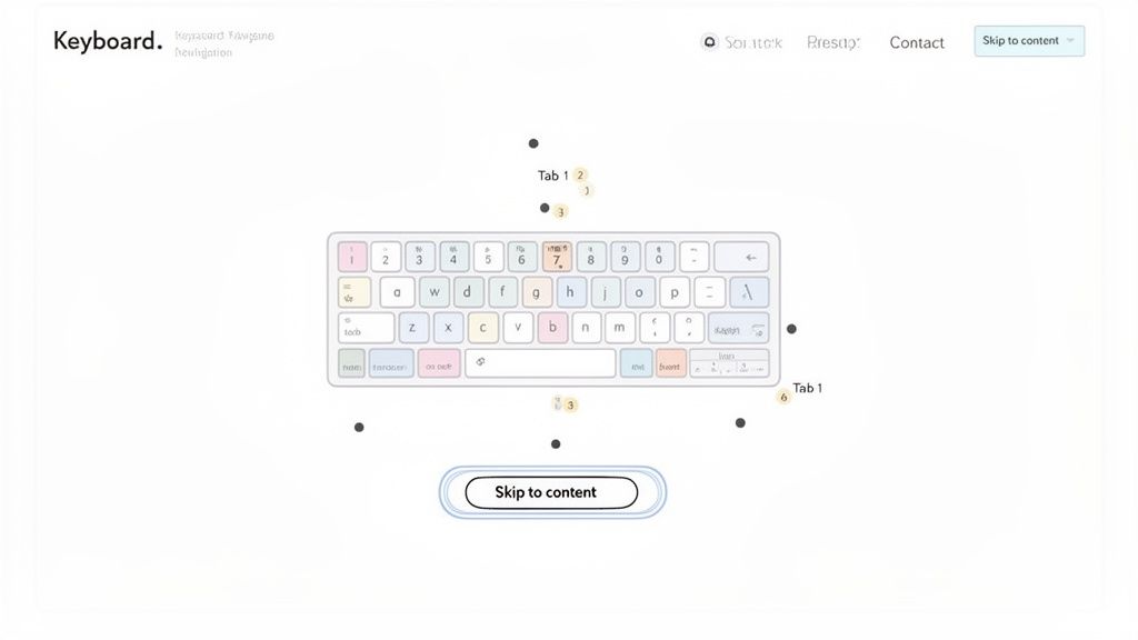
TL;DR: Verify that your entire website can be used with only a keyboard. Ensure interactive elements like links, buttons, and form fields receive a clear visual highlight (focus indicator) in a logical order as users press the Tab key. This is fundamental for users with motor disabilities and those using screen readers.
A critical first step in any accessibility audit is testing for complete keyboard operability. This ensures that users who cannot operate a mouse, including those with motor disabilities or who rely on assistive technologies, can navigate and interact with every part of your website. The core principle is that any action achievable with a mouse must also be achievable with a keyboard.
This involves two key components: navigation (moving between elements) and focus management (knowing where you are). A logical focus order, typically following the visual layout from top-to-bottom and left-to-right, is crucial for an intuitive user experience.
Why It Matters
Proper keyboard support is a non-negotiable requirement under WCAG 2.1.1 (Keyboard). Without it, entire user groups are locked out of your digital content. Companies like Google and GitHub have set a high standard, demonstrating how comprehensive keyboard support enhances usability for all users, including power users who prefer keyboard shortcuts for efficiency.
How to Check It
Manual Test: Put your mouse aside. Use the Tab key to move forward through interactive elements and Shift+Tab to move backward. Use Enter to activate links/buttons and the Spacebar to toggle checkboxes or buttons.
Automated Tools: While manual testing is essential, tools like axe DevTools can help identify elements that are not focusable or lack a visible focus indicator.
Pass/Fail Criteria & Remediation
Pass: You can access and operate every interactive element, including menus, forms, and modals, in a logical sequence without using a mouse. A highly visible focus indicator (e.g., a colored outline) is always present.
Fail: You get "stuck" in a section (a "keyboard trap"), cannot see where the focus is, or cannot reach an element that is clickable with a mouse.
Remediation:
"Skip to main content" link: Implement this as the first focusable element on every page to help users bypass repetitive navigation.
CSS
focus-visible: Use the:focus-visiblepseudo-class to style focus indicators, ensuring they appear for keyboard users but not necessarily for mouse clicks.Semantic HTML: Use native
<button>,<a>, and<input>elements, as they have built-in keyboard accessibility. Avoid using non-interactive elements like<div>or<span>for buttons without adding appropriate ARIA roles and tabindex attributes.
2. Screen Reader Compatibility Testing
TL;DR: Test your website using popular screen readers like NVDA, JAWS, and VoiceOver to ensure that blind and low-vision users can understand and interact with your content. Proper semantic HTML, ARIA labels, and logical heading structures are essential for an experience that is navigable and comprehensible.
Beyond keyboard navigation, a crucial part of your accessibility audit is ensuring your site works with screen readers. These assistive technologies convert on-screen text and interface elements into speech or braille, enabling users with visual impairments to navigate the web. For a screen reader to work effectively, the underlying code must be structured semantically.
This involves providing context that isn't visually apparent. Elements like headings, lists, links, and form controls must be coded correctly so the screen reader can announce their purpose and state. For example, a screen reader should announce "button, submit" for a submit button, not just "submit." This is a fundamental check in any comprehensive website audit checklist.
Why It Matters
Screen reader compatibility is a core requirement of WCAG 2.1.1 (Text Alternatives) and 4.1.2 (Name, Role, Value). Without it, a significant portion of the population cannot access your information or services. Organizations like the BBC and LinkedIn have invested heavily in screen reader testing, proving that a well-structured site not only meets compliance standards but also creates a more robust and usable experience for everyone.
How to Check It
Manual Test: The most reliable method is to test with real screen readers. Download NVDA (free), or use built-in tools like VoiceOver (macOS/iOS) or Narrator (Windows). Navigate your site using only the keyboard and listen to how the content is announced.
Automated Tools: Browser extensions like WAVE or axe DevTools can detect many common issues, such as missing alt text on images or improper ARIA attribute usage, which directly impact the screen reader experience.
Pass/Fail Criteria & Remediation
Pass: All content is read logically, interactive elements are clearly identified, images have descriptive alt text, and users can complete key tasks (like filling out a form) without confusion.
Fail: The screen reader announces generic or confusing information (e.g., "click here"), content is read out of order, or critical elements are completely silent and skipped over.
Remediation:
Semantic HTML: Prioritize native HTML elements like
<nav>,<main>,<h1>-<h6>, and<button>over generic<div>s. This provides built-in accessibility.ARIA for Context: Use ARIA (Accessible Rich Internet Applications) roles and attributes like
aria-labeloraria-describedbyto add necessary context to custom components, but only when semantic HTML is insufficient.Image Alt Text: Ensure every meaningful image has descriptive alt text. For decorative images, use an empty alt attribute (
alt="") so screen readers skip them. For a deeper dive into this topic, you can learn more about screen reader compatibility testing procedures.
3. Color Contrast & Visual Clarity
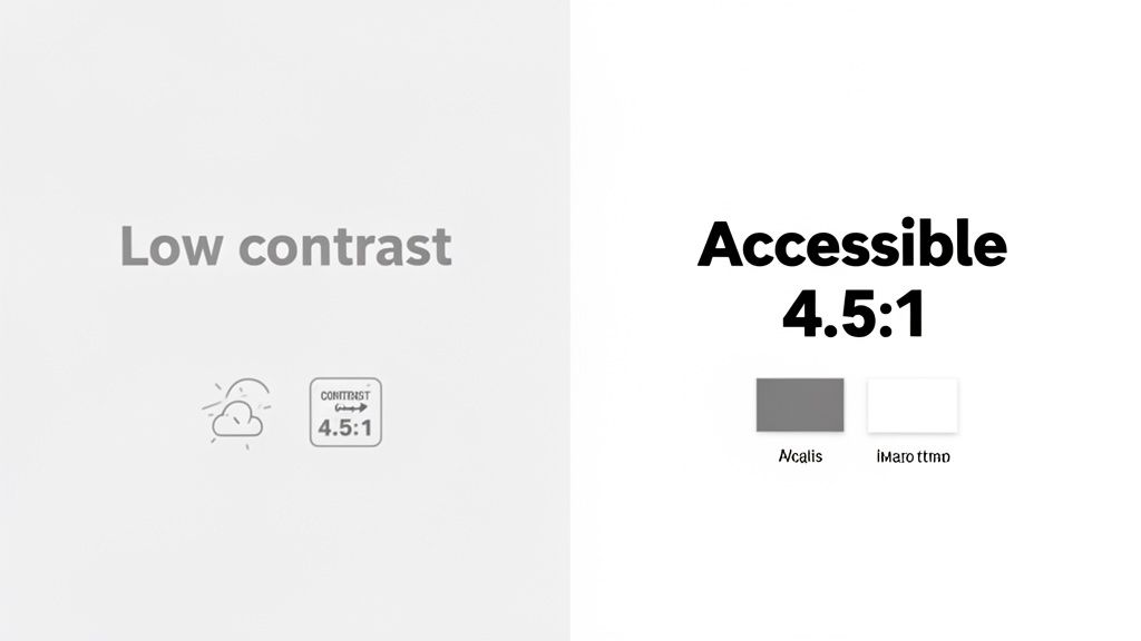
TL;DR: Ensure all text has sufficient color contrast against its background to be readable for everyone, including users with low vision or color blindness. Adhere to WCAG's minimum ratio of 4.5:1 for normal text and 3:1 for large text, and avoid using color as the sole means of conveying information.
Ensuring visual clarity is a cornerstone of an accessible and user-friendly design. This involves auditing the contrast ratio between text and its background to guarantee readability. For millions of users with visual impairments like low vision or color blindness, text with low contrast can become difficult or impossible to read, effectively acting as a barrier to your content.
This principle extends beyond just text; it also mandates that information conveyed with color must have a non-color-based alternative. For example, a required form field marked only in red would be indistinguishable to a color-blind user. A complete website audit checklist must prioritize this foundational aspect of inclusive design.
Why It Matters
High contrast is a core requirement under WCAG 2.1 Success Criterion 1.4.3 (Contrast Minimum). Major brands like Apple and Netflix have integrated high-contrast modes and accessible color palettes into their design systems, recognizing that clear, legible content improves the user experience for everyone, not just those with disabilities. It reduces eye strain and improves comprehension in various lighting conditions.
How to Check It
Manual Test: Use a browser extension or an online tool like the WebAIM Color Contrast Checker to sample foreground and background colors from your site's text, icons, and interface elements.
Automated Tools: Platforms like axe DevTools and WAVE can automatically scan your pages to flag text elements that fail to meet the required contrast ratios, significantly speeding up your audit process.
Pass/Fail Criteria & Remediation
Pass: All normal-sized text meets a 4.5:1 contrast ratio, and large text (18.66px bold or 24px regular) meets a 3:1 ratio. Information is never conveyed using color alone.
Fail: Any text, including text within images, falls below the required contrast ratios. An error message is only indicated by the color red without an accompanying icon or text.
Remediation:
Adjust Color Palette: Darken text or lighten backgrounds in your CSS to meet the minimum ratios. Document these accessible color combinations in your brand's design system.
Use Patterns & Icons: Supplement color-coded information (e.g., in charts or forms) with patterns, labels, or icons to ensure the meaning is clear without relying on color perception. For more tips, you can learn more about color contrast and accessibility on webability.io.
Check Interactive States: Ensure that hover, focus, and active states for links and buttons also maintain sufficient color contrast for both the text and the state indicator itself.
4. Alt Text & Image Description Accuracy
TL;DR: Ensure every meaningful image on your site has descriptive alternative (alt) text. This text should convey the image's content and purpose for screen reader users and search engines. Accurate alt text is essential for accessibility, SEO, and situations where images fail to load.
An essential component of any website audit checklist is verifying that visual content is accessible to everyone. Alt text provides a textual alternative to images, allowing users with visual impairments who rely on screen readers to understand the information and context conveyed by a graphic. It’s not just about compliance; it's about creating a complete and equitable user experience.
This audit point goes beyond simply checking for the presence of an alt attribute. The focus is on the accuracy and quality of the description. The text must be meaningful and contextually relevant, accurately describing what the image depicts and why it’s important to the surrounding content. Decorative images, however, should have an empty alt attribute (alt="") so screen readers can ignore them.
Why It Matters
Proper alt text is a foundational requirement of WCAG 2.1 Success Criterion 1.1.1 (Non-text Content). Sites like Wikipedia excel at this by maintaining rigorous standards for image descriptions, ensuring their vast visual library is accessible. Meaningful alt text also strengthens your SEO strategy by providing search engines with valuable context about your page's content, improving image search rankings.
How to Check It
Manual Test: Use your browser's "Inspect" tool to view the HTML of an image and check its
altattribute. Alternatively, use a browser extension like the Web Developer Toolbar to display all alt text on a page at once.Automated Tools: SEO crawlers like Screaming Frog and Ahrefs can quickly identify missing or empty alt attributes across your entire site. Accessibility-focused tools like WAVE can also flag these issues.
Pass/Fail Criteria & Remediation
Pass: All informative images have descriptive, accurate alt text. Decorative images have an empty alt attribute (
alt=""). The text conveys the image's purpose without being overly verbose.Fail: Informative images are missing alt text, have generic text (e.g., "image1.jpg"), or the description is inaccurate or fails to capture the essential information.
Remediation:
Write clear descriptions: Describe the image as you would to someone over the phone. Be concise (under 125 characters is a good guideline) and avoid starting with "Image of..." as screen readers announce this already.
Context is key: Ensure the alt text reflects why the image is relevant to the content. For a company logo, the alt text should be the company name.
Create content guidelines: Establish clear alt text standards for your content creators and developers to ensure consistency and quality across the site.
Handle complex images: For charts or infographics, provide a brief summary in the alt text and link to a separate page or a section below with a detailed text description.
5. Form Accessibility & Input Validation
TL;DR: Ensure all form fields have clear, associated labels, provide helpful error messages, and allow users to review submissions. Accessible forms are vital for conversions, data collection, and user engagement, especially for users relying on assistive technologies.
Forms are the heart of user interaction online, serving as the primary channel for everything from signing up for a newsletter to completing a purchase. A core part of any website audit checklist is verifying that these forms are fully accessible, with proper labels, clear instructions, and intuitive input validation to guide users successfully.
This involves ensuring every input field is programmatically linked to a visible label, making it clear to screen readers what information is required. When errors occur, messages must be descriptive, specific, and positioned near the problematic field so users can easily correct their mistakes without frustration.
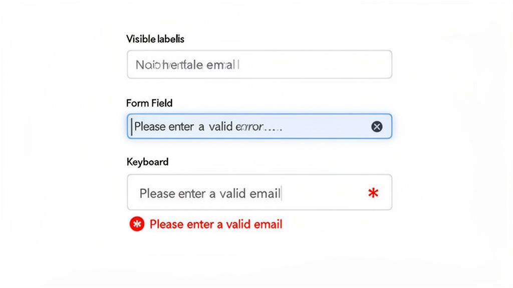
Why It Matters
Inaccessible forms directly impact conversions and can create significant legal risks under WCAG 2.1 Success Criterion 3.3 (Input Assistance). Companies like Stripe and Salesforce invest heavily in form accessibility because they understand that a seamless, error-tolerant process is crucial for business success. Clear, accessible forms reduce user abandonment and ensure everyone can complete critical tasks.
How to Check It
Manual Test: Use your keyboard to navigate through the form. Ensure every field has a visible label that receives focus when you click it. Intentionally trigger errors to see if the messages are clear, helpful, and announced by screen readers.
Assistive Technology: Use a screen reader (like NVDA or VoiceOver) to navigate the form. Verify that labels are read aloud for each input and that error messages and
aria-invalidstates are properly announced.Code Review: Inspect the HTML to confirm that
<label>elements are used with theforattribute correctly pointing to theidof the associated input, or thataria-labelis used appropriately.
Pass/Fail Criteria & Remediation
Pass: Every form control has a programmatic label. Error messages are descriptive, non-generic, and associated with their respective fields. Users can review and confirm information before final submission.
Fail: Inputs lack labels ("orphan" inputs). Error messages are vague (e.g., "Invalid input") or rely only on color. Required fields are not identified programmatically.
Remediation:
Use
<label>: Always wrap form inputs with a<label>or use theforattribute to create an explicit connection. For inputs without a visible label, usearia-label.ARIA for Validation: Use
aria-required="true"for mandatory fields and dynamically setaria-invalid="true"when an input fails validation. Usearia-describedbyto link error message text to the input field.Clear Instructions: Provide inline help text for complex fields (e.g., password requirements) and ensure users can review and correct information before final submission. Provide a clear success message upon completion.
6. Heading Structure & Content Hierarchy
TL;DR: Ensure your page uses headings (
<h1>,<h2>,<h3>, etc.) in a logical, hierarchical order to create a clear document outline. A single<h1>should define the main topic, with subsequent heading levels used to structure subsections without skipping levels. This is crucial for screen reader navigation and improves SEO and scannability for all users.
A well-organized heading structure acts as the table of contents for a web page. It allows users, particularly those using screen readers, to quickly understand the page's organization and navigate directly to the section they need. Far from being just a stylistic choice for bigger text, semantic headings provide critical structural information that underpins a good user experience.
This practice involves using heading tags in a descending and logical order. The main page title should be the one and only <h1>. Major sections under it use <h2>, subsections of those use <h3>, and so on. This creates a clear, predictable hierarchy that benefits both assistive technologies and search engine crawlers, making it a key item in any website audit checklist.
Why It Matters
Proper heading structure is a core component of WCAG 2.1 Success Criterion 1.3.1 (Info and Relationships). It provides programmatic relationships between content sections. Websites like Smashing Magazine and the Mozilla Developer Network (MDN) are excellent examples of this principle in action, using a strict heading hierarchy to make complex technical articles easy to navigate and digest.
How to Check It
Manual Test: Visually inspect the page content to see if the heading hierarchy makes sense. Use a browser extension like the "Web Developer" toolbar or WAVE to view the document outline and instantly spot issues like skipped heading levels or multiple
<h1>tags.Automated Tools: SEO tools like Screaming Frog and Ahrefs' Site Audit can crawl your entire site and flag pages with missing
<h1>tags, duplicate<h1>s, or incorrect heading order.
Pass/Fail Criteria & Remediation
Pass: The page has exactly one
<h1>. All subsequent headings follow a logical, nested order without skipping levels (e.g., an<h2>is never followed directly by an<h4>). The heading text accurately describes the content that follows.Fail: There are multiple
<h1>s, no<h1>at all, skipped heading levels, or headings are used for stylistic purposes rather than structural organization (e.g., using an<h3>just for its font size).Remediation:
Establish a Single
<h1>: Ensure every page's main, unique title is wrapped in an<h1>tag.Fix Skipped Levels: Review your content structure. If you have an
<h3>following an<h1>, either promote it to an<h2>or add an appropriate<h2>above it.Use CSS for Styling: Never use a heading tag for visual effect. If you need text to look a certain way, use CSS classes. Train content creators to separate structure (
<h..>tags) from presentation (CSS).Avoid Vague Headings: Ensure heading text is descriptive. Instead of "More Info," use a heading like "Product Shipping & Return Policies."
7. Mobile Accessibility & Responsive Design
TL;DR: Ensure your website provides an accessible and usable experience on mobile devices. Test that your responsive design works with touch controls, screen readers like VoiceOver and TalkBack, and different screen orientations without loss of content or functionality.
With over 60% of web traffic originating from mobile devices, a mobile-first approach to accessibility is no longer optional. A responsive design that simply reflows content is insufficient; the user experience must be fully accessible to individuals using touch interfaces and mobile assistive technologies. This part of your website audit checklist focuses on ensuring usability across various screen sizes, orientations, and interaction methods.
This involves verifying that all functionality is available and easy to use on a small screen. Key considerations include adequate touch target sizes to prevent accidental taps, logical content reordering on smaller viewports, and full compatibility with built-in mobile screen readers.
Why It Matters
Mobile accessibility is explicitly addressed in WCAG 2.1, particularly under Success Criterion 2.5.5 (Target Size). A failure to provide a mobile-friendly accessible experience alienates a massive segment of your audience and can lead to legal risk. Companies like Airbnb and Uber have invested heavily in mobile accessibility, recognizing that a seamless experience for users with disabilities on their phones directly impacts their bottom line and brand reputation.
How to Check It
Manual Test: Use your site on actual iOS and Android devices. Test with built-in screen readers: VoiceOver (iOS) and TalkBack (Android). Pinch to zoom and ensure text reflows correctly and is readable. Rotate the device to check both portrait and landscape modes.
Browser DevTools: Use your browser's device emulation mode to quickly check various screen sizes. Chrome's DevTools also includes a "Toggle device toolbar" to simulate touch events and different resolutions.
Specialized Tools: Use a tool like a Touch Target Analyzer extension to visually inspect the size and spacing of interactive elements.
Pass/Fail Criteria & Remediation
Pass: All content and functionality are available and usable on mobile devices. Touch targets are at least 44x44 CSS pixels. The site works flawlessly in both portrait and landscape orientation, and is fully operable with VoiceOver and TalkBack.
Fail: Content is cut off, users must scroll horizontally to read text, or touch targets are too small and close together. Interactive elements like modals or menus do not work correctly with mobile screen readers.
Remediation:
Sufficient Target Size: Ensure all interactive elements like buttons and links meet the minimum 44x44px target size with adequate spacing to prevent errors.
Responsive Layout: Use a fluid grid and flexible images. Avoid setting fixed widths that break layouts on smaller screens.
Viewport Meta Tag: Implement
<meta name="viewport" content="width=device-width, initial-scale=1.0">to ensure your page scales correctly on all devices. Never useuser-scalable=no, as it disables zooming, a critical accessibility feature.Test on Real Devices: Emulators are useful, but nothing replaces testing on physical smartphones and tablets to understand the true user experience with touch gestures and mobile assistive technologies.
8. Video & Multimedia Captioning
TL;DR: Ensure all video and audio content includes captions, transcripts, and audio descriptions. This makes media accessible to users with hearing or vision impairments and benefits all users in various environments, such as noisy or quiet settings.
As multimedia becomes a core part of digital communication, its accessibility is paramount. A comprehensive website audit checklist must verify that time-based media, like videos and podcasts, is usable for everyone. This involves providing text alternatives for audio content and audio alternatives for visual information, ensuring no user is excluded from the message.
This process covers three critical components: captions for dialogue and important sounds, transcripts for a complete text version of all audio, and audio descriptions to narrate key visual actions that are not apparent from the main soundtrack.
Why It Matters
This is a fundamental requirement under WCAG 2.1 Success Criterion 1.2 (Time-based Media). Leading platforms like Netflix and the BBC have normalized these features, setting a standard for accessible media consumption. Failing to provide captions or audio descriptions effectively denies users with disabilities access to your information, posing significant legal and ethical risks. Beyond compliance, captions improve comprehension and engagement for all users, including those in sound-sensitive environments or non-native speakers. For a deeper dive into making video content truly accessible, you can also explore resources on understanding closed captioning and its implementation.
How to Check It
Manual Review: Play all videos and audio files on your site. Confirm that accurate, synchronized captions can be toggled on. For videos, listen for audio descriptions during pauses in dialogue to ensure visual context is provided. Check for a link to a full transcript.
Content Governance: Review your content creation guidelines. Do they mandate the creation of captions, transcripts, and audio descriptions as part of the production workflow?
Pass/Fail Criteria & Remediation
Pass: All prerecorded multimedia has accurate and synchronized captions and audio descriptions. A full transcript is readily available. Live video streams use real-time captioning services.
Fail: Videos lack captions, rely solely on inaccurate auto-generated captions, have no audio descriptions for important visual content, or do not offer transcripts.
Remediation:
Professional Services: Use services like Rev or 3Play Media to generate high-quality captions and transcripts for critical content. Avoid relying exclusively on auto-generation.
Provide Transcripts: Post a full text transcript on the same page as the media or link to it directly below the player. This also boosts SEO by making video content crawlable.
Audio Descriptions: For videos where visual information is not conveyed through dialogue, record a separate audio track that describes the on-screen action and add it as a user-selectable option.
Update Standards: Integrate accessibility requirements into your content creation process, making captions and transcripts a standard deliverable for all new multimedia.
9. Link Text & Navigation Clarity
TL;DR: Audit all link text to ensure it's descriptive and makes sense when read out of context. Vague phrases like "click here" or "read more" fail screen reader users who often navigate by scanning a list of links. Clear, predictable navigation is essential for a user-friendly website.
Descriptive link text is a cornerstone of an accessible and intuitive website. Users, particularly those using screen readers, frequently generate a list of all links on a page to quickly navigate. When links are labeled with generic text like "learn more," this list becomes a meaningless and frustrating jumble, completely obscuring the purpose and destination of each link.
This audit point in our website audit checklist focuses on ensuring every link clearly communicates its function or destination. This benefits not only screen reader users but also improves SEO and enhances usability for everyone by setting clear expectations and making navigation more efficient.
Why It Matters
This practice is mandated by WCAG 2.4.4 (Link Purpose - In Context). Ambiguous links force users to guess where they are going, increasing cognitive load and creating a poor user experience. Websites like Wikipedia and BBC excel at this, embedding descriptive links directly into content, which provides context and improves the flow of information for all readers.
How to Check It
Manual Test: Scan your pages for generic link text like "click here," "read more," or "link." Read only the link text aloud, divorced from surrounding sentences. Does it still make sense?
Automated Tools: Tools like Siteimprove or axe DevTools can automatically flag common ambiguous link text issues, making it easy to spot them at scale across your website.
Pass/Fail Criteria & Remediation
Pass: The vast majority of links clearly describe their destination or the action they perform without needing the surrounding text for context.
Fail: The site relies heavily on generic link text, forcing users to read the entire paragraph to understand a link's purpose.
Remediation:
Rewrite Link Text: Instead of "To download our report, click here," use "Download our 2024 annual report."
Use ARIA for Context: For links with limited visual space (e.g., an icon link), use
aria-labelto provide a descriptive text for screen readers. Example:<a href="..." aria-label="Read our privacy policy"><i class="icon-policy"></i></a>.Distinguish Links & Buttons: Use
<a>tags for navigation (going to another page) and<button>tags for actions (submitting a form, opening a modal). This semantic clarity is vital for assistive technology.
10. Accessibility Legal Compliance & Policy Documentation
TL;DR: Document your commitment to accessibility by creating a public accessibility statement, maintaining internal policies, and keeping detailed records of audits and remediation efforts. This process is crucial for demonstrating good-faith compliance with legal standards like the ADA and WCAG, reducing legal risk.
Beyond technical fixes, a comprehensive website audit checklist must include governance and legal preparedness. This means formally documenting your organization's commitment, processes, and progress toward meeting accessibility standards. It involves creating a public-facing accessibility statement, maintaining internal policies, and keeping meticulous records of all audits and the steps taken to fix identified issues.
This documentation serves as a critical defense and a demonstration of due diligence. In the event of legal scrutiny, being able to produce clear records of your compliance efforts, remediation plans, and timelines can be invaluable. It shifts the conversation from negligence to proactive, ongoing improvement.
Why It Matters
High-profile legal cases, like those involving Domino's and Target, have underscored that website accessibility is a legal requirement under the Americans with Disabilities Act (ADA). Failing to maintain and document a compliance strategy exposes organizations to significant legal and financial risk. A formal policy and transparent documentation show a good-faith effort to comply with various regulations, including WCAG, Section 508, and the AODA. For more details on these regulations, you can learn more about website accessibility laws.
How to Check It
Review Internal Policies: Does your organization have a formal, documented accessibility policy? Are roles and responsibilities clearly defined?
Audit Trail Analysis: Can you produce records of past accessibility audits, including the findings, the dates, and the remediation actions taken?
Public-Facing Statement: Check your website for a clear, easy-to-find Accessibility Statement. This statement should affirm your commitment, mention the standard you aim to meet (e.g., WCAG 2.1 AA), and provide a contact method for users to report issues.
Pass/Fail Criteria & Remediation
Pass: Your organization has a published accessibility statement, maintains an internal accessibility policy, and can provide a clear audit trail documenting ongoing remediation efforts.
Fail: There is no public accessibility statement, no internal policy, and no formal records of past audits or fixes. Compliance efforts are ad-hoc and undocumented.
Remediation:
Create an Accessibility Statement: Draft and publish a statement on your website. Use a template as a starting point, but customize it to reflect your specific goals and progress.
Establish a Governance Plan: Create an internal document that outlines your accessibility policy, defines roles, sets goals, and schedules regular training for your team.
Document Everything: Use a project management tool or a dedicated spreadsheet to log all accessibility issues found during audits. For each issue, track its status, the person responsible, and the date it was resolved.
10-Point Website Accessibility Audit Comparison
| Item | Implementation complexity | Resource requirements | Expected outcomes | Ideal use cases | Key advantages | Primary challenges |
|---|---|---|---|---|---|---|
| Keyboard Navigation & Focus Management | Medium — straightforward for native controls, higher for custom components | Developers, QA, keyboard testing on browsers | Full keyboard operability and visible focus management | Web apps, dashboards, enterprise tools, power-user interfaces | Enables motor-impaired users; improves efficiency and keyboard-user experience | Custom components and third‑party widgets often need extra work |
| Screen Reader Compatibility Testing | High — requires deep semantic and ARIA knowledge | Screen reader experts, multiple OS/device testing, user testing | Accurate content announcement and usable navigation by blind users | Content-heavy sites, public services, educational platforms | Serves blind/low-vision users; improves structure and SEO | Specialized skills, platform variability, time‑intensive testing |
| Color Contrast & Visual Clarity | Low — mostly design and CSS adjustments | Designers, contrast tools, manual checks in lighting conditions | Improved readability and compliance with WCAG contrast ratios | Brand-driven sites, text-heavy pages, public information sites | Benefits low-vision users; simple to audit and implement | Brand palette constraints; AAA targets limit design flexibility |
| Alt Text & Image Description Accuracy | Low–Medium — many items but simple rules | Content authors, editorial review, AI-assisted tools | Screen-reader-friendly images and better SEO/discoverability | Image-rich sites, e-commerce, news/media sites | Immediate accessibility and SEO gains; easy fixes at scale | Time-consuming for large libraries; complex images need long descriptions |
| Form Accessibility & Input Validation | Medium — requires careful UX and validation design | Developers, QA, UX writers, accessibility testing | Clear labels, descriptive errors, higher conversion and fewer support requests | Checkout flows, registrations, data-entry systems | Directly improves conversions and reduces user errors | Complex validation logic and third‑party forms can be tricky |
| Heading Structure & Content Hierarchy | Low — content-focused fixes with CSS styling | Content editors, CMS configuration, audits | Logical document structure for navigation and SEO | Blogs, documentation, long-form content, knowledge bases | Simple to implement; improves scannability and screen-reader navigation | CMS misuse and legacy content often break hierarchy |
| Mobile Accessibility & Responsive Design | High — touch, layout, and screen-reader differences | Mobile devices for testing, designers, developers, QA | Accessible mobile experiences, proper touch targets and responsiveness | Mobile-first sites, apps, commerce platforms | Reaches large mobile audience; improves usability and performance | Fragmented devices/OS behavior; complex testing matrix |
| Video & Multimedia Captioning | High — involves media workflows and content creation | Captioning services, transcribers, QA, possibly CART for live | Captions, transcripts, audio descriptions for inclusive multimedia | Streaming platforms, training content, marketing videos | Serves deaf/hard-of-hearing users; improves SEO and engagement | Resource‑intensive; quality/sync and live captioning challenges |
| Link Text & Navigation Clarity | Low — content editing and pattern updates | Content editors, UX writers, simple automated scans | Descriptive links that make sense out of context and better navigation | News sites, portals, large content repositories | Immediate UX and screen-reader improvements; SEO benefits | Balancing brevity and descriptiveness; legacy content cleanup |
| Accessibility Legal Compliance & Policy Documentation | High — requires audits, legal knowledge, governance | Accessibility auditors, legal counsel, cross-team stakeholders | Formal compliance reports, remediation roadmaps, reduced litigation risk | Enterprises, regulated sectors, organizations facing legal exposure | Demonstrates good-faith compliance; aids governance and prioritization | Time-consuming, evolving regulations, ongoing monitoring required |
Turning Your Audit into Action: The Path to Continuous Improvement
Completing the comprehensive website audit checklist outlined in this article is a monumental first step. You've moved beyond abstract concepts and delved into the tangible mechanics of your website’s health, from foundational SEO and performance metrics to the critical nuances of accessibility and user experience. The true value of this exhaustive process, however, isn't found in the finished checklist itself but in what you do with the data you've gathered. The audit is the diagnostic tool; the real work begins with the cure.
Think of your audit report not as a final grade but as a strategic blueprint. It’s a detailed map highlighting opportunities for growth, areas of risk, and pathways to a superior digital presence. By methodically working through each item, you’ve pinpointed everything from broken links and slow-loading scripts to critical accessibility gaps that could be turning away valuable users. Now is the time to translate these findings into a clear, prioritized, and actionable plan.
From Checklist to a Living Roadmap
The most common failure point after a thorough audit is inaction. To avoid this, you must transform your findings into a dynamic roadmap for continuous improvement. This isn't about fixing everything at once; it's about creating a sustainable system for progress.
Prioritize with Precision: Start by categorizing your findings. Use a matrix that weighs impact against effort. Critical security vulnerabilities, major accessibility barriers (like failed keyboard navigation), and core performance issues that cripple user experience should be at the top of your list. A non-critical color contrast issue on a footer link, while important, can be scheduled after you’ve fixed a form that screen reader users cannot submit.
Assign Clear Ownership: Every identified task needs a champion. Assign each remediation item to a specific person or team (e.g., "Developer-A to fix heading structure," "Content-Team to rewrite alt text for Q3 blog posts"). Ambiguity is the enemy of progress. When everyone knows their responsibility, accountability naturally follows.
Establish Timelines and Milestones: Attach realistic deadlines to each task. Break larger projects, like a complete content overhaul or implementing video captions across your entire media library, into smaller, manageable milestones. This approach builds momentum and makes the overall project feel less daunting.
Weaving Audits into Your Organizational DNA
A one-time audit provides a snapshot, but a culture of continuous auditing creates a lasting competitive advantage. The goal is to evolve from a reactive "fix-it" model to a proactive "build-it-right" philosophy. This cultural shift is where true digital excellence is forged.
Integrate, Don't Isolate: Instead of treating your website audit checklist as a separate, periodic event, embed these checks directly into your existing workflows. You can book a manual accessibility audit from Webability for an expert review of your website
Development Sprints: Add accessibility checks like screen reader testing and focus management to your pre-launch quality assurance process, while incorporating accessibility testing automation for repeatable checks throughout development.
Content Creation: Make alt text, proper heading structure, and descriptive link text a mandatory part of your content publishing guidelines, just like checking for grammar and spelling.
Design Phase: Ensure your design team uses color contrast checkers and considers keyboard navigation from the earliest wireframes, preventing costly fixes down the line.
By embedding these principles, you prevent new issues from being introduced. Your website doesn't just get fixed; it stays healthy. This proactive governance transforms the checklist from a remediation tool into a powerful framework for quality control, ensuring every new feature, page, and post enhances your site’s integrity. Embracing this journey transforms your website from a static digital brochure into a dynamic, resilient, and truly user-centric platform that serves, retains, and delights every single visitor.
Ready to move from manual checks to automated, continuous compliance? The WebAbility.io platform is designed to turn the principles of this website audit checklist into an effortless, integrated part of your workflow. Let our technology handle the monitoring, reporting, and user-facing accessibility tools so you can focus on building a better digital experience for everyone. Discover how WebAbility.io can streamline your path to a fully accessible and optimized website.
Quick Questions
Tap to ask AI about this article