Accessibility and Mobility: A Guide for Digital Teams

Sidharth Nayyar
28.7% of adults in the United States, about 61 million people, live with a disability according to AudioEye's summary of U.S. disability statistics. For many of those users, mobility challenges don't end at the sidewalk, doorway, or transit stop. They continue into websites, apps, forms, checkouts, portals, and support flows.
Key takeaways
- Accessibility and mobility are closely linked. If moving through physical space is difficult, digital access often becomes the practical path to shopping, healthcare, work, and services.
- Mobility barriers show up in interface details. Small click targets, drag-only interactions, hover menus, short timeouts, and confusing forms can block users with motor impairments.
- Good accessibility improves outcomes for more than one audience. It helps keyboard users, switch-device users, voice-navigation users, people using a phone one-handed, and anyone under real-world constraints.
- Teams need a roadmap, not just a checklist. Audit first, fix common blockers, test with assistive technology, and monitor continuously.
- Business value follows usability. If users can complete key tasks with less effort, conversion paths tend to become clearer and stronger.
Why Digital Mobility Matters Now More Than Ever
A lot of teams still treat mobility as a physical-world topic. They think about ramps, elevators, curb cuts, and transit access. That's important, but it's incomplete.
Digital systems now carry everyday tasks that used to require in-person movement. People book appointments online, refill prescriptions online, apply for jobs online, order groceries online, and manage finances online. If those experiences assume steady hands, precise pointer control, or fast repeated motion, they create a different kind of barrier.
Digital access often replaces physical travel
The practical point is simple. When a person can't easily travel to a location, your website or app may become the location.
That's why the idea of inclusive mobility matters. It isn't only about physical access. It also includes digital access, affordability, geographic equity, and safety/comfort, as described in Elinta Charge's explanation of inclusive mobility. For digital teams, that changes the job. You're not just designing a nice interface. You're building access to services.
Practical rule: If a task matters in the physical world, assume the digital version needs to work without fine motor precision.
Project managers and developers often get confused. They hear “accessibility” and think mostly about screen readers or color contrast. Those matter, but mobility-related access has its own patterns. Users may interact by keyboard only. They may use switch devices. They may rely on voice commands. They may need more time to complete a form or larger targets to avoid accidental activation.
Accessibility and mobility are product quality issues
When a team improves mobility access, it usually improves the product for everyone else too. A larger button helps a user with tremors, and it also helps a parent holding a child, a commuter using a phone on a train, or a customer with a temporary injury. Keyboard-friendly flows help someone using assistive tech, and they also help power users who prefer not to leave the keyboard.
That overlap matters because it moves accessibility out of a narrow compliance box and into everyday product decisions. The better question isn't “Do we support disability use cases?” It's “Can people complete important tasks with the input methods they have?”
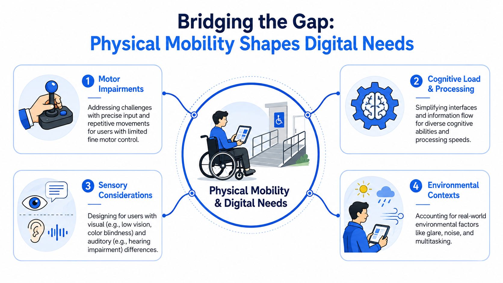
Bridging the Gap How Physical Mobility Shapes Digital Needs
Physical mobility limitations map directly to interface behavior. Once you see the connection, design choices that looked minor start to look foundational.
A narrow hallway and a tiny button are the same kind of problem
Think about a wheelchair user approaching a hallway that's too tight to move through comfortably. The issue isn't effort alone. The issue is tolerance. There isn't enough room for error.
A tiny button creates the same problem on a screen. A user with tremors, limited range of motion, or reduced fine motor control may know exactly what they want to click, but the interface gives them almost no margin.
Here's how that translation often works:
- Limited fine motor control means users need larger click or tap areas, more forgiving spacing, and fewer interactions that depend on precision.
- Limited range of motion means reaching across the screen repeatedly can be tiring or impossible, especially on mobile.
- Repetitive strain or pain means long forms, repeated confirmations, and extra steps create more fatigue than teams expect.
- Paralysis or severe motor impairment may mean a person uses a keyboard, switch control, or voice input instead of a mouse.
Input method changes the whole user journey
Developers sometimes assume “can use the web” means “can use a mouse.” That assumption breaks quickly in real use.
A person using voice input may say “Click Submit” and expect the button label to be exposed clearly. A keyboard-only user expects the focus order to move logically through menus, fields, and actions. Someone using a switch device may advance through interactive elements one at a time, which makes cluttered layouts and duplicated controls much more exhausting.
Good mobility support isn't only about whether a feature exists. It's about how much physical effort the feature demands.
The same idea applies to forms. If a checkout asks for many fields, has strict timeout behavior, hides instructions until an error occurs, and requires drag-and-drop for file upload, the journey becomes physically expensive. That effort doesn't show up in analytics as a “motor barrier.” It shows up as abandonment, retries, support requests, and incomplete transactions.
Mobility access is broader than motor control alone
Mobility-related design also intersects with cognition, sensory conditions, and environment. A user might have a motor impairment and low vision. They might use a speech tool in a noisy room. They might make their way one-handed while managing assistive equipment.
That's why teams should think in combinations rather than categories. The cleaner the flow, the more predictable the focus order, and the more obvious the controls, the better the experience for users whose physical reality doesn't match the default desktop-mouse model.
Common Digital Barriers for Users with Mobility Impairments
Legacy design often creates digital dead ends. The easiest way to recognize them is to follow a user journey and notice where precision, speed, or repeated movement becomes mandatory.
The physical analogy is familiar. As noted in Urban SDK's discussion of mobility equity, only 23% of New York City subway stations were fully ADA accessible as of 2019. Old infrastructure can keep excluding people long after the rules are clear. Websites and apps do the same thing when old interaction patterns stay in place.
Navigation barriers
A user lands on a retail site and tries to open the main menu with a keyboard. Focus disappears into a promotional banner. The category menu opens only on hover. A submenu collapses before the user can reach it.
Those issues are common because teams often test with a mouse and assume everyone else can improvise. But hover-dependent navigation, small menu hit areas, and custom components with broken focus behavior quickly block mobility access.
For teams that want a clearer language baseline, this is a good place to explore accessibility terms.
Input barriers
Forms are where many mobility problems become costly. A date picker may require tiny arrow controls. Error messages may appear far from the field that caused them. Session timers may expire while the user is still entering information.
Common friction points include:
- Short time limits that don't allow users to complete forms at their own pace
- Tiny controls in date pickers, quantity selectors, and dismiss buttons
- Pointer-only actions such as sliders or signature fields that don't support keyboard alternatives
- Auto-advancing fields that move unexpectedly while someone is still dictating or tabbing
Interaction barriers beyond forms
Some interfaces fail even before the user reaches checkout. Drag-and-drop boards, carousels with hidden controls, map-based selection tools, and floating chat widgets can all become obstacles if they trap focus or require fine pointer movement.
Multimedia can add another layer. If instructions or service information are delivered through video, captions and labels help users who rely on multimodal access or who can't easily replay and scrub controls. For a practical explanation of terminology and implementation differences, Whisper AI's guide to video captions is useful.
When a task requires accuracy, speed, and repetition at the same time, many users with mobility impairments are effectively locked out.
Designing and Developing for Mobility Access
The fastest way to improve accessibility and mobility is to remove unnecessary physical effort from core tasks. Start with the interactions that affect revenue and service delivery: navigation, search, account access, forms, booking, checkout, support, and document handling.
Build for keyboard use first
If a user can't complete a flow with a keyboard, the flow probably has mobility problems even if it looks polished.
That means every interactive element should be reachable, usable, and visible in focus order. Users need to know where they are on the page at all times. Custom dropdowns, dialogs, accordions, and tabs should behave consistently with expected keyboard patterns.
Physical design standards show why precision matters. National RTAP's summary of DOT/ADA standards notes details such as a 96-inch minimum clear length, 60-inch minimum clear width, and cross-slope no steeper than 1:48 for bus stop boarding and alighting areas in its ADA toolkit guidance. Digital design needs that same mindset. Small deviations that seem minor can make an interface hard to use.
Make targets forgiving and layouts calm
Teams often ask how to support motor-impaired users without redesigning the whole product. Usually, the answer is to simplify interaction mechanics.
Focus on these adjustments:
- Enlarge target areas so users don't need pixel-level accuracy. The WebAbility.io target size guide is a useful reference point for this topic.
- Add spacing between controls so accidental activation is less likely.
- Avoid hover-only disclosure for menus, help text, and secondary actions.
- Keep primary actions stable so buttons don't shift position after validation or content loading.
- Support straightforward dismissal for overlays, banners, and chat prompts.
Give users more time and fewer surprises
A motor-accessible experience respects pace. Users may need longer to type, dictate, tab, review, or recover from an accidental action.
Practical improvements include a mix of technical and content changes:
| Area | Better approach |
|---|---|
| Form timeout | Let users extend time or save progress |
| Error handling | Place clear guidance near the field and preserve entered data |
| Multi-step flow | Show progress and allow backtracking without loss |
| Repeated actions | Reduce duplicate confirmations and unnecessary clicks |
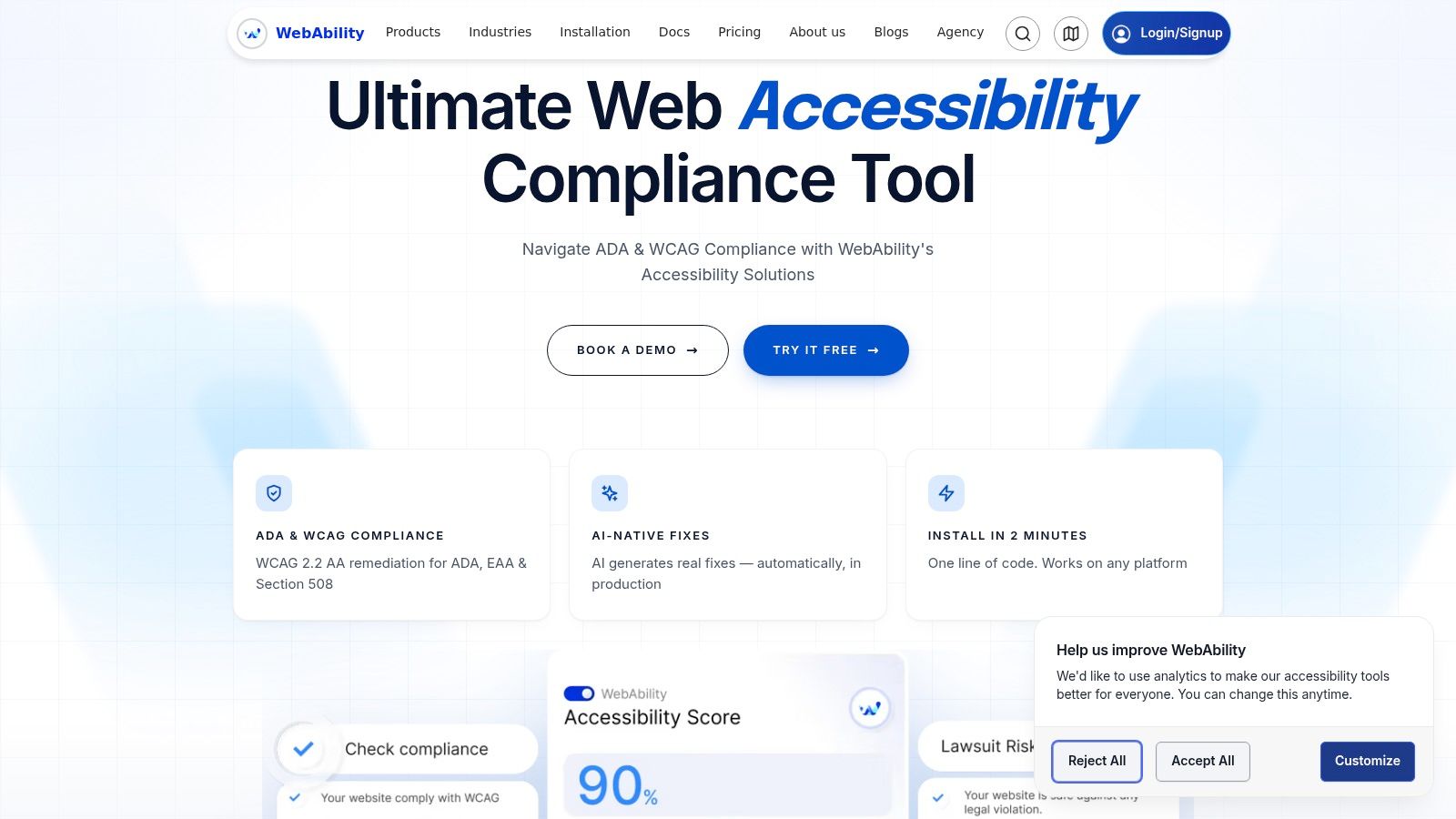
One tool teams may use here is WebAbility.io, which offers an accessibility platform with an AI-enhanced widget, scanning, monitoring, and compliance support. For some teams, that can help accelerate implementation of common accessibility features while manual remediation work continues.
A short demo can help teams visualize what “supportive defaults” look like in practice.
Design for alternative inputs, not just alternatives to the mouse
Voice navigation, switch access, on-screen keyboards, and other assistive methods change what “easy” means. A visually minimal interface may still be difficult if controls aren't named clearly or if the page contains too many similar actions.
Field note: A simple page with obvious labels often outperforms a sleek page with hidden behaviors.
Good mobility access usually comes from predictable structure, visible focus, clear labels, generous targets, and task flows that don't punish slower or nonstandard input.
Testing Strategies and Assistive Technologies
Accessibility work isn't finished when a component passes design review. It's finished when a user can complete the task with the tools they rely on.
Start with a keyboard-only pass
A keyboard test catches a surprising number of mobility barriers. Open the page, put your mouse aside, and try to complete the key journey with Tab, Shift+Tab, Enter, Space, and arrow keys where appropriate.
Check for these failure patterns:
- Lost focus when modals open or close
- Focus traps that prevent exit from widgets or menus
- Invisible indicators that make current position unclear
- Wrong order that jumps users around the page
- Mouse-only controls in calendars, sliders, uploaders, and navigation
A simple test script makes this process more repeatable. If your QA team needs help structuring scenarios, Figr's test case creation guide offers a practical framework you can adapt for accessibility checks.
Combine automated checks and manual review
Automated tools can flag missing labels, contrast issues, and some structural problems. They're useful, but they won't tell you whether a checkout flow is exhausting for someone using switch access or voice navigation.
Manual testing should include core paths such as:
- Signing in
- Searching or browsing
- Completing a form
- Recovering from an error
- Finishing a transaction or request
The assistive technology mix matters too. Users with mobility impairments may rely on voice control, switch devices, alternative keyboards, head pointers, or other non-mouse methods. If your team wants a broader grounding in the field, this comprehensive guide to assistive tech is a useful starting point.
Test effort, not just success
A pass/fail mindset misses an important detail. Some experiences are technically possible but physically draining.
Ask better questions during review:
- How many actions does the task require?
- Where does precision matter more than it should?
- Can users recover easily from a mistake?
- Do repeated interactions create fatigue over time?
That last question matters a lot in enterprise software, healthcare portals, and ecommerce. If users perform the same action dozens of times, even a small interaction burden becomes significant.
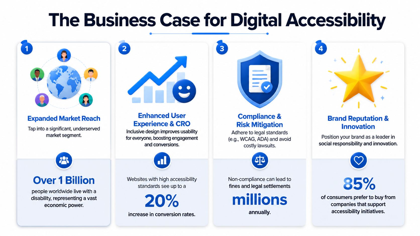
The Business Case Compliance CRO and Market Reach
The strongest business case for accessibility and mobility is simple. If people can reach the destination they came for, more of them will complete meaningful actions.
That idea comes straight from transportation thinking. Strong Towns distinguishes mobility from accessibility, where mobility is about movement and accessibility is about how many destinations a person can reach in a given time in its explanation of the difference. Digital products have the same split. A fast website can still fail if users can't find their way, submit, purchase, or get support.
Compliance matters because access matters
Legal compliance is often the first thing executives ask about, and that's understandable. Public-facing websites and digital services are part of how organizations deliver access. When preventable barriers remain in place, legal risk rises alongside user frustration.
But compliance works best as an operating discipline, not a one-time scramble. Teams that build accessible patterns into design systems, templates, QA workflows, and content governance usually make steadier progress than teams that rely only on periodic fixes.
Better usability supports conversion
CRO and accessibility often point to the same fixes. Clear forms, visible focus states, larger targets, predictable navigation, and lower-friction checkout paths don't only help users with disabilities. They remove drop-off points for everyone.
That's why accessibility work often belongs in revenue discussions, not just compliance discussions. If a key flow requires less effort, more users can finish it. If navigation is easier to understand, people reach product pages and support resources with less confusion. If form errors are easier to fix, fewer leads disappear halfway through.
For stakeholders making budget decisions, this can help justify web accessibility investments.
A page that loads quickly but blocks action is efficient in the wrong way.
Market reach grows when exclusion shrinks
Accessibility and mobility also affect reach. If customers can't use your service independently, many won't convert, return, or recommend it. Some won't even get past the first interaction barrier.
This is especially relevant for organizations with digital-first service models. Healthcare, finance, education, SaaS, government, and ecommerce all depend on self-service flows. When those flows support a wider range of input methods and user needs, the addressable audience becomes more real, not just more theoretical.
Your Roadmap to Inclusive Digital Mobility
Teams usually don't need a grand reset. They need a sequence that turns accessibility and mobility into normal product work.
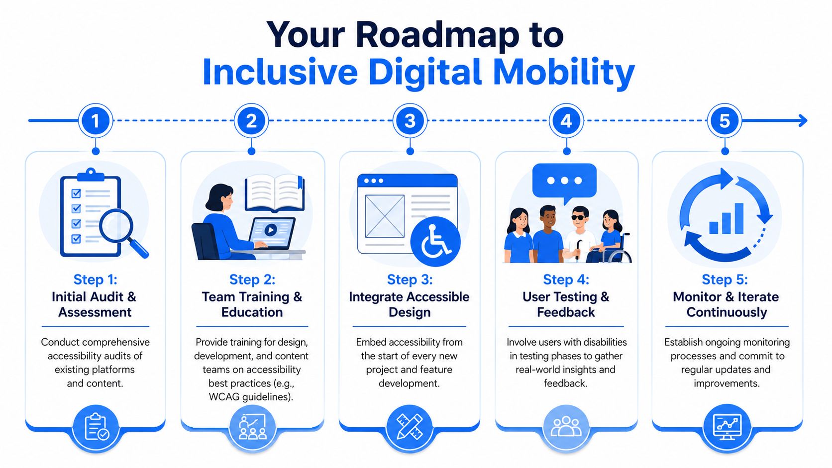
Step 1 Audit the paths that matter most
Start with the journeys that carry the most user value and business value. For many teams, that means homepage navigation, product discovery, pricing, booking, lead forms, checkout, account access, and support.
Don't audit only templates. Audit real tasks.
A useful first pass includes:
- Keyboard review of top workflows
- Automated scanning for common code-level issues
- Component inspection for menus, dialogs, forms, tabs, and carousels
- Content review for labels, instructions, and error messaging
Step 2 Train the people who shape the interface
Accessibility problems often begin upstream. A designer chooses a tiny dismiss icon. A developer ships a custom control without keyboard support. A content editor writes vague button text. A product owner approves a timeout without asking how users will extend it.
Training works best when it's role-specific:
| Team | Focus area |
|---|---|
| Design | Target size, focus visibility, interaction simplicity |
| Development | Keyboard support, semantic structure, form behavior |
| Content | Clear labels, concise instructions, helpful errors |
| QA | Task-based testing with non-mouse input methods |
Step 3 Fix recurring blockers in the design system
Individual page fixes help, but system-level changes last longer. If your button component, modal pattern, form validation pattern, and navigation shell are accessible, every team benefits.
Prioritize the patterns that produce repeated friction:
- Navigation menus and submenus
- Dialogs and overlays
- Form fields and validation
- Buttons, links, and clickable cards
- Tables, filters, and sortable lists
Accessibility work then begins to pay off operationally. One strong component prevents many future defects.
Step 4 Validate with real user effort in mind
Testing shouldn't stop at “can complete.” Watch for strain, retries, and avoidable repetition.
A practical review checklist looks like this:
- Can the user complete the task without a mouse
- Can they tell where focus is
- Can they activate controls without precision
- Can they recover from mistakes without starting over
- Can they move at their own pace
The most useful accessibility fix is often the one that removes an extra step.
Step 5 Monitor and maintain
Accessibility and mobility aren't static because products aren't static. New campaigns launch, components change, frameworks update, and content shifts every week.
Ongoing maintenance usually includes recurring scans, manual regression checks on priority journeys, issue tracking by severity, and clear ownership. Teams that sustain progress tend to make accessibility part of release readiness rather than a separate side project.
The goal isn't perfection in one sprint. The goal is a product practice where inclusion keeps improving as the product evolves.
If you're turning this into an operational plan, WebAbility.io is worth reviewing as part of your toolkit. It offers accessibility scanning, monitoring, compliance support, and an AI-enhanced widget, which can help teams organize remediation work and support ongoing accessibility efforts alongside design, development, and QA.
Quick Questions
Tap to ask AI about this article