Master WCAG with a Web Accessibility Color Checker

Sidharth Nayyar
Sidharth Nayyar
Ready to make your website accessible? Engage with our team or start a free trial today.
Tap to ask AI about this article
TL;DR: A web accessibility color checker is an essential tool to ensure your website's text is readable for everyone, especially users with visual impairments. It helps you meet WCAG standards (like the 4.5:1 contrast ratio) which improves user experience, expands your audience, and can boost conversions. Integrating a checker into your workflow, from design to deployment, and complementing it with a comprehensive platform like the WebAbility.io Accessibility Platform, is a smart strategy for building a more inclusive and successful website.
A web accessibility color checker is your secret weapon for making sure the text on your website is actually readable. At its core, this tool checks if the color contrast between your text and its background meets the official accessibility standards. It's all about ensuring your content works for everyone, especially users with visual impairments, by calculating a contrast ratio based on WCAG guidelines—specifically 4.5:1 for normal text and 3:1 for large text.
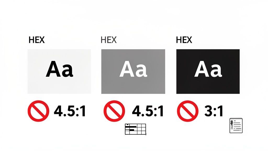
When you’re designing a website, it’s easy to get lost in the aesthetics of your color palette. But the contrast between your text and its background is more than just a design choice—it's a cornerstone of digital inclusion. This is where a web accessibility color checker becomes indispensable. As an experienced accessibility professional, I've found it to be a simple diagnostic tool that tells you, in seconds, if a huge part of your audience can even use your site.
From my firsthand experience conducting accessibility audits, low color contrast is one of the most common issues. It’s a massive barrier for people with low vision, color blindness, and other visual challenges, rendering your content difficult or totally impossible to read. This isn't just a minor hiccup; you're effectively shutting the door on millions of potential users.
The Web Content Accessibility Guidelines (WCAG) give us clear, measurable benchmarks for color contrast. These aren’t just random numbers; they’re backed by extensive research into how people perceive and read text on a screen.
A web accessibility color checker takes all the guesswork out of this. You just plug in the HEX or RGB codes for your text and background, and it gives you an instant pass or fail. It’s that simple.
Making this check a habit early in your design process can save you from costly and frustrating fixes later on. If you want to really get into the weeds on this, check out our deep dive into color contrast accessibility where we break down all the nuances.
I've seen it time and time again: beautiful, on-brand color palettes that completely fail accessibility standards. A classic mistake is using light gray text on a white background or getting carried away with a trendy pastel theme for buttons and links.
Using a color checker helps your team avoid these problems from the get-go. Here’s a quick look at how some common color combinations stack up against the WCAG AA standard.
| Text Color | Background Color | Contrast Ratio | WCAG AA Status |
|---|---|---|---|
#757575 (Gray) | #FFFFFF (White) | 4.6:1 | Pass |
#CCCCCC (Light Gray) | #FFFFFF (White) | 1.6:1 | Fail |
#FF5733 (Orange) | #FFFFFF (White) | 2.9:1 | Fail (Pass for Large) |
#007BFF (Blue) | #FFFFFF (White) | 3.3:1 | Fail (Pass for Large) |
Ultimately, a web accessibility color checker empowers you to make design decisions that are both beautiful and functional for everyone. It's a foundational step toward building a more usable website, serving a broader audience, and showing that your brand is genuinely committed to inclusivity.
When we talk about color contrast, it’s easy to get lost in the technical jargon of ratios and guidelines. But at its core, this isn't a technical problem—it's a human one. Poor color choices build digital walls, plain and simple.
Think about a user with low vision trying to read light gray text on a slightly off-white background. For them, a simple visit to your site becomes a frustrating exercise in futility. Or picture someone with color blindness trying to spot a red error message inside a green-bordered form field. That critical information might as well be invisible.
These scenarios aren't niche "edge cases." They are the daily reality for a massive portion of the population. A website that someone can't read is, for all intents and purposes, a broken website. It’s crucial to understand the real-world impact of these design decisions, especially when considering the experience for blind and visually impaired individuals.
Poor contrast is an epidemic online. We've all squinted at a screen, struggling to read text that seems to blend into the background. A web accessibility color checker is the first step in diagnosing this widespread issue, and the statistics are jarring.
A staggering 96% of the world's top one million homepages fail basic accessibility tests, and low contrast is one of the most common culprits. On average, these sites have 50.8 accessibility errors each, with many stemming directly from poor color choices.
The Web Content Accessibility Guidelines (WCAG) 2.2 give us clear, achievable targets to fix this:
Hitting these numbers isn't about checking a box; it's about making sure your message actually lands with your entire audience.
Making your site accessible isn't just the right thing to do—it's also a smart business move. When you prioritize readable design, you instantly open your brand to a much larger market. Globally, people with disabilities control an estimated $13 trillion in disposable income. Choosing to ignore them is like leaving money on the table.
Beyond that, good color contrast improves the user experience for everyone. Clear, legible text reduces eye strain and makes information easier to process. This leads directly to people spending more time on your site and being less likely to leave in frustration.
By making your digital content clear and legible, you foster a more positive interaction with your brand. This directly translates into higher engagement, stronger brand loyalty, and increased conversion rates.
Put yourself in your customer's shoes. If they can't read your product descriptions or find the "Buy Now" button, you've lost a sale. Accessibility isn't an expense; it's an investment in your bottom line.
In a competitive market, brand reputation is invaluable. A clear commitment to inclusivity shows that you value every single customer, setting you apart from competitors who are still behind the curve.
This commitment delivers real, tangible benefits:
Ultimately, building a tool like a web accessibility color checker into your workflow is a strategic decision. It’s about creating a better, more inclusive, and more profitable experience for every person who lands on your site. You can explore more on how accessibility boosts your website's UX and sales in our in-depth guide.
Let's get straight to it: not all color checkers are built the same. The secret is finding one that slots right into your workflow. Your goal is simple: grab the hex or RGB codes for your text and background, plug them into a checker, and see if you pass the WCAG AA (4.5:1 ratio) or the stricter AAA (7:1 ratio).
The best tool for a designer building a mockup in Figma is different from what a developer needs for a quick check on a live site. It’s all about picking the right tool for the job. Free tools like the WebAbility.io WCAG Contrast Checker are a fantastic starting point for anyone.
The most effective tool is the one your team will actually use. When you integrate accessibility checks early and often, you stop problems before they start, saving yourself from expensive redesigns and frustrating code rewrites later on.
Here’s a look at the most common types of color checkers and where they shine:
Poor color contrast isn't just a compliance issue; it's a business problem. When users can't read your content, they get frustrated and leave.
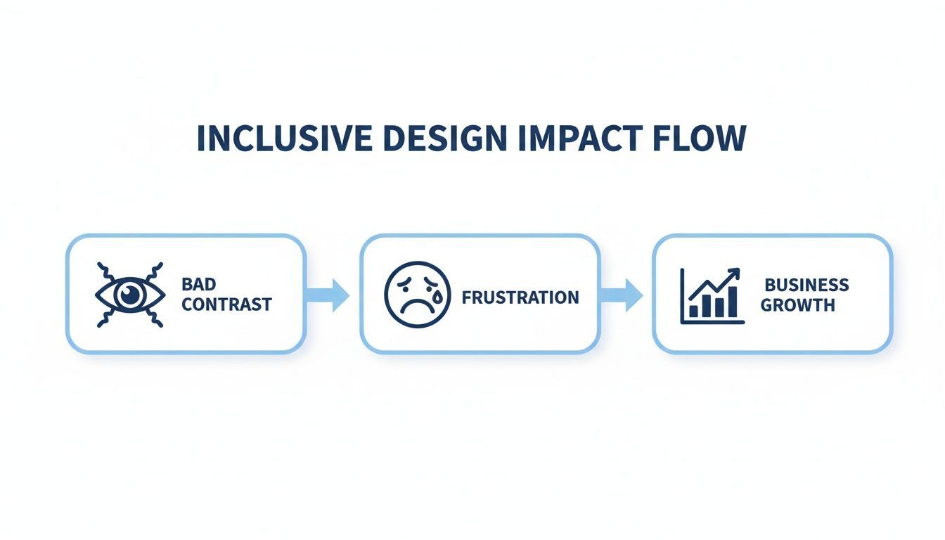
As you can see, what starts as a design choice directly impacts user experience, which in turn can hinder your growth.
Once you've picked your tool, the actual process of checking colors is straightforward. The key is making it a habit, a natural part of your design and development rhythm.
Here's a simple, repeatable workflow that I've seen work time and again:
A critical mistake I see teams make is only testing static text. True accessibility means checking every state of your interface.
Don't forget about your interactive elements! Make sure to test the contrast for links, buttons, and form fields in all their different states:
To really nail this, you need to go beyond the basics. One of the trickiest situations is checking text placed over images or gradients. This is where automated tools can fall short and a human eye is essential.
Since the background isn't a single, solid color, you can't just plug in one HEX code. The right way to do this is to find the part of the image behind the text that has the lowest contrast and test that specifically. Often, the best solution is to add a semi-transparent overlay behind the text or a subtle text-shadow to ensure it's readable no matter what part of the image it's over.
To help you decide which tool is the best fit for your team's process, here's a quick comparison of the different types available.
This table breaks down the features, primary use cases, and limitations of the most common categories of color contrast tools you'll encounter.
| Tool Type | Best For | Key Features | Example Workflow |
|---|---|---|---|
| Browser Extensions | Developers, QA Testers, Content Managers | On-the-fly page analysis, element inspection | Inspect a live webpage to check a button's contrast, then test its hover state. |
| Design Tool Plugins | UI/UX Designers | Proactive design, palette creation, real-time feedback | Build an accessible color palette in Figma and test combinations as you design components. |
| Standalone Web Tools | Anyone needing a quick check | Manual HEX/RGB input, simple interface | Quickly verify if your proposed brand colors meet WCAG AA standards for body text. |
Ultimately, using a web accessibility color checker effectively is about building a habit. By embedding these quick checks into your daily design and development process, you shift from reacting to accessibility problems to preventing them from ever happening.
Trying to wrap your head around the legal side of web accessibility can feel overwhelming. The good news is that it all boils down to a core set of standards. Color contrast isn’t just a nice-to-have design choice; it's a fundamental requirement in major regulations that protect both users and your organization.
Whenever you fire up a web accessibility color checker, you're not just tweaking colors—you're taking a concrete step toward meeting those critical legal benchmarks.
Think of the Web Content Accessibility Guidelines (WCAG) 2.2 as the global gold standard. Most accessibility laws around the world, like Section 508 in the US and EN 301 549 in Europe, are built on WCAG’s framework. So, if you meet WCAG criteria, you’re already well on your way to broad legal compliance.
When an accessibility audit flags a color contrast problem, it's pointing to a very specific rule within WCAG. Most organizations aim for what's called WCAG 2.2 Level AA conformance, and for good reason.
Here’s a quick breakdown of the regulations you'll hear about most often:
By simply fixing your color contrast, you're knocking out one of the most common—and most visible—barriers to access. It's a clear signal that you’re making a good-faith effort to serve every user.
These rules aren't just abstract legal jargon; they have a massive impact on daily life for millions. A web accessibility color checker is the tool that helps bridge the gap.
For instance, at the AA level, WCAG requires a 4.5:1 contrast ratio for normal text and 3:1 for large text or interface elements. For the stricter AAA level, that ratio jumps to 7:1 for body text to better support users with low vision.
The numbers are staggering. A WebAIM analysis found that an unbelievable 96% of the top million websites have accessibility failures. Contrast issues were found on over 70% of homepages, which had an average of 50.8 errors each. When you consider that color blindness affects roughly 8% of men and 0.5% of women—about 300 million people worldwide—it's clear that poor contrast is a widespread problem. You can get more details from Level Access on how their free checker helps validate against standards like Section 508 or EN 301 549.
Let's be frank: ADA-related lawsuits are increasing, and a non-compliant website is a genuine business risk. The best defense is a proactive offense, and that starts with fundamentals like readable text. Keeping a record of your color contrast testing is a smart part of any legal defense strategy.
By systematically checking and fixing color contrast issues, you're creating a tangible record of your commitment to accessibility. This proactive approach helps shift the narrative from putting out fires to responsible governance, reducing legal risk while building a more resilient digital presence.
Viewing compliance this way turns it from a burden into a strategic advantage. You protect your organization from legal trouble, open your site to a wider audience, and build a brand that people trust.
To get started on the right foot, a comprehensive accessibility program is key. The WebAbility.io Accessibility Platform provides a structured path toward building a website that is not only legally sound but also works for everyone.
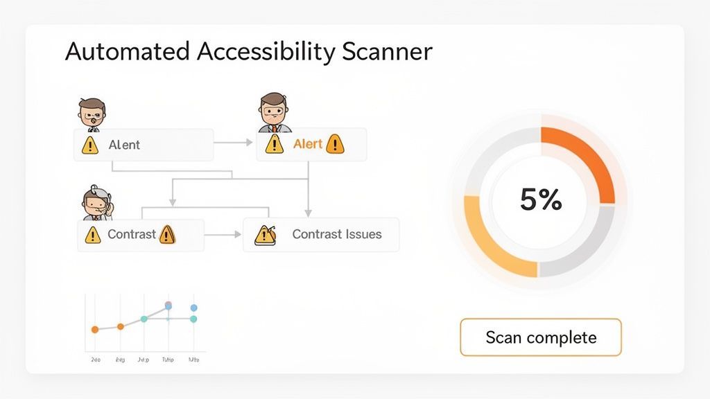
Running a spot-check with a web accessibility color checker is a solid first step. But here’s the thing: those checks are just a snapshot in time. The moment you update a page or a developer pushes new code, that snapshot is already out of date.
For accessibility that actually sticks, you need a system that works as hard as you do. This is where automated platforms come in. They take accessibility from a series of one-off fixes and turn it into an ongoing part of how you run your site. These tools are always on, working in the background to give you the scale and consistency that manual checks just can't match.
Think about this scenario: your marketing team launches a brilliant new landing page. In the rush to go live, someone uploads a banner image with text that has poor color contrast. Without automation, this barrier could sit there for weeks or months, frustrating users and creating a compliance risk.
An automated scanner, on the other hand, flags that issue almost immediately. This is the core of modern accessibility management. You get real-time insight into your site's health instead of relying on periodic audits that are obsolete the day after they're finished.
The biggest wins from automated scanning are:
By building in an automated scanner, you create a safety net that helps ensure all new content and code changes meet your accessibility standards from day one.
A constant stream of alerts isn't helpful if you can't manage it. That’s why the best platforms, like WebAbility.io, don’t just find problems—they give you a centralized dashboard to turn all that raw data into a clear action plan.
This dashboard becomes the single source of truth for your entire organization's accessibility status. It’s mission control. You can see your overall compliance score at a glance, get a prioritized list of issues, and assign fixes to the right people. Suddenly, accessibility isn't just a developer's problem; it's a shared responsibility across teams.
An accessibility dashboard makes abstract compliance goals concrete. It allows you to set clear benchmarks, track progress, and confidently report on your accessibility efforts to leadership.
With historical reporting, you can pull up a graph and show exactly how your compliance score has improved. This kind of documentation is incredibly valuable for demonstrating good-faith efforts and minimizing legal risks tied to the ADA and other regulations.
While your team works on backend fixes, another layer of technology can empower your visitors directly. Many accessibility solutions come with a user-facing widget that lets people adjust the site to fit their needs, all without you having to make permanent code changes.
These tools offer a menu of on-demand adjustments to tackle common barriers, especially those related to color and text.
This approach gives users an immediate win and shows a genuine commitment to inclusivity. Meanwhile, your team can use the backend platform to work on the permanent, code-level fixes. For a complete solution that brings together user controls and backend governance, it's worth exploring the WebAbility.io Accessibility Platform.
This combination of continuous scanning, a central governance dashboard, and user-facing tools creates a complete accessibility ecosystem. It takes the good work you started with a web accessibility color checker and builds on it with the scale and data you need to maintain a truly inclusive digital presence.
Here's the bottom line: If your brand colors fail a contrast check, it's not the end of the world. Simply reserve them for decorative flair and choose accessible alternatives for crucial text. You should be checking contrast constantly—from the first design mock-up to every new deployment. And remember, good contrast makes for a better user experience, which is something search engines definitely reward.
When teams first start digging into digital accessibility with a web accessibility color checker, a few questions almost always pop up. Let's walk through the most common ones I hear from designers and developers.
This is easily the most frequent—and most panicked—question I get. Teams worry they have to abandon their entire brand identity. The good news is, you don't. A color combination failing WCAG standards just means you have to be smart about where you use it.
Let's say your main brand color is a vibrant, light green that fails against a white background. You can absolutely still feature it on your site. Just don't use it for body copy.
Instead, try these approaches:
Here's the rule of thumb I give every team: Your brand colors are for branding; your accessible colors are for communication. Keep your official palette for brand expression, but have a set of high-contrast, compliant colors ready for all body text, links, and button labels.
The short answer? Constantly. Color contrast isn't a one-and-done checkbox you tick off at the start of a project. It needs to be an ongoing part of your entire workflow.
Think of it as a continuous quality check that happens at every stage:
There's no direct ranking factor in Google's algorithm called "color contrast ratio." But to say it doesn't affect SEO would be a huge mistake. The indirect impact on your search performance is significant because good color contrast is a pillar of good user experience (UX).
When your content is easy for everyone to read, people naturally engage with it more. They are far more likely to:
Search engines pick up on all of these positive user signals. They see that people find your site valuable and usable, which in turn helps boost your rankings. By improving usability with something as fundamental as color contrast, you're directly improving the metrics that matter most to SEO.
Ready to make accessibility a core part of your strategy? WebAbility.io provides an all-in-one platform with automated scanning and a user-facing accessibility widget to ensure your site is compliant and user-friendly.