WCAG 2.2 Compliance: Build Accessible Tables

Sidharth Nayyar
You're probably dealing with one of two table problems right now. Either the design calls for dense data with expandable details, or you inherited a custom “table” built from divs that looks fine visually and falls apart the second you test it with a keyboard or screen reader.
That's where WCAG 2.2 compliance gets practical. The hard part usually isn't the guideline itself. It's building a component that still feels fast, clean, and reusable in React or Vue while preserving native semantics, clear state, and predictable focus behavior. Expandable rows are a good example because they mix structure, interaction, and conditional rendering in one place.
The approach that works is boring in the best way. Start with native table markup. Add only the ARIA needed to communicate state. Keep keyboard behavior conventional. Then test the actual user path, not just the DOM.
The Quick Guide to Accessible Expandable Rows
If you only need the short version, use this checklist.
Keep real table semantics. Use
<table>,<thead>,<tbody>,<tr>,<th>, and<td>. Don't fake a data table with generic containers if the content is tabular.Put the row toggle on a real button. The expand control belongs inside a table cell and should be a native
<button>, not a clickable div.Expose state programmatically. Pair
aria-expandedon the button witharia-controlsthat points to the expandable row or region.Make the expanded content contextual. The extra panel should tell assistive tech what it belongs to, usually through a label tied to the row's primary identifier.
Support keyboard use without surprises. Tab should reach the button naturally. Enter and Space should toggle it. Focus should stay visible and stable.
Treat this as product quality, not just compliance. A clean expandable row lowers friction on data-heavy pages because users can reveal detail without losing scanability.
That's more urgent than many teams assume. The 2026 WebAIM Million report found that 95.9% of home pages had detected WCAG 2 failures, with an average of 56.1 accessibility errors per page. Accessible component patterns matter because teams reuse them everywhere.
Practical rule: if an expandable row isn't understandable without a mouse, it isn't ready for production.
For conversion-focused pages, this pattern also helps in a less obvious way. Users can compare options, review status, or inspect details without being pushed into separate pages or overloaded by a wall of content.
Laying the Foundation with Semantic HTML
Most expandable-row failures start before JavaScript. They start in the markup.
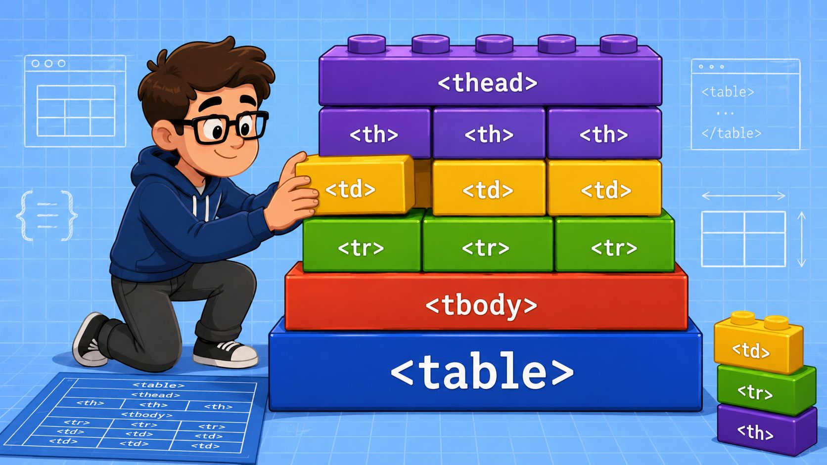
If the content is tabular, build a real table first. That gives browsers and assistive technologies the relationships they already know how to expose: header associations, row order, cell boundaries, and reading context. WCAG 2.2 was officially published in October 2023, and the W3C specification for WCAG 2.2 makes this version the current benchmark while remaining backward-compatible with WCAG 2.0 and 2.1.
Use the table elements the platform already understands
A solid expandable-row pattern starts like this:
<table> <thead> <tr> <th scope="col">Order</th> <th scope="col">Customer</th> <th scope="col">Status</th> <th scope="col">Details</th> </tr> </thead> <tbody> <tr> <th scope="row" id="order-1042">#1042</th> <td>Jordan Lee</td> <td>Shipped</td> <td> <button type="button" aria-expanded="false" aria-controls="details-1042"> Show details </button> </td> </tr> <tr id="details-1042" hidden> <td colspan="4"> Shipment tracking, line items, and support actions </td> </tr> </tbody> </table> This is plain, but that's the point. The first row remains a normal data row. The second row holds the expandable content. Nothing here depends on a framework, and nothing here asks assistive tech to guess what you meant.
If your team needs a refresher on why this matters, this glossary entry on semantic HTML for WCAG standards is a useful reference to keep in design-system docs.
What works and what breaks fast
Here's the trade-off developers run into. Div-based “tables” can feel easier when you want responsive layouts, animation control, or custom grid behavior. But you pay for that convenience with extra role mapping, more fragile navigation, and more screen-reader ambiguity.
A better split looks like this:
| Pattern | Use it when | Risk level |
|---|---|---|
Native <table> | Data needs row and column relationships | Low |
| CSS cards | Content stops being truly tabular on mobile | Manageable |
| Div grid pretending to be table | Visual layout only, no real tabular semantics needed | High if used for data |
A native table gives you a robust baseline. Every custom substitute creates more behavior you have to rebuild and retest.
For teams shipping brochure sites, dashboards, and client portals, this is the same discipline behind stable small business web solutions. Start with structure the browser already understands, then layer interaction on top. Don't reverse that order.
Keep the toggle control native
The expand trigger should live in a cell and should be a <button>. That gives you keyboard activation, focusability, and state support without custom event gymnastics.
Avoid these patterns:
Clickable table row because it blurs navigation and action into one target.
Span with role="button" because you're rebuilding behavior the browser already provides.
Button nested in another interactive wrapper because focus and activation become inconsistent.
When developers say accessibility is “hard,” they often mean they started from a custom abstraction that removed the platform defaults.
Weaving in ARIA for Dynamic State Management
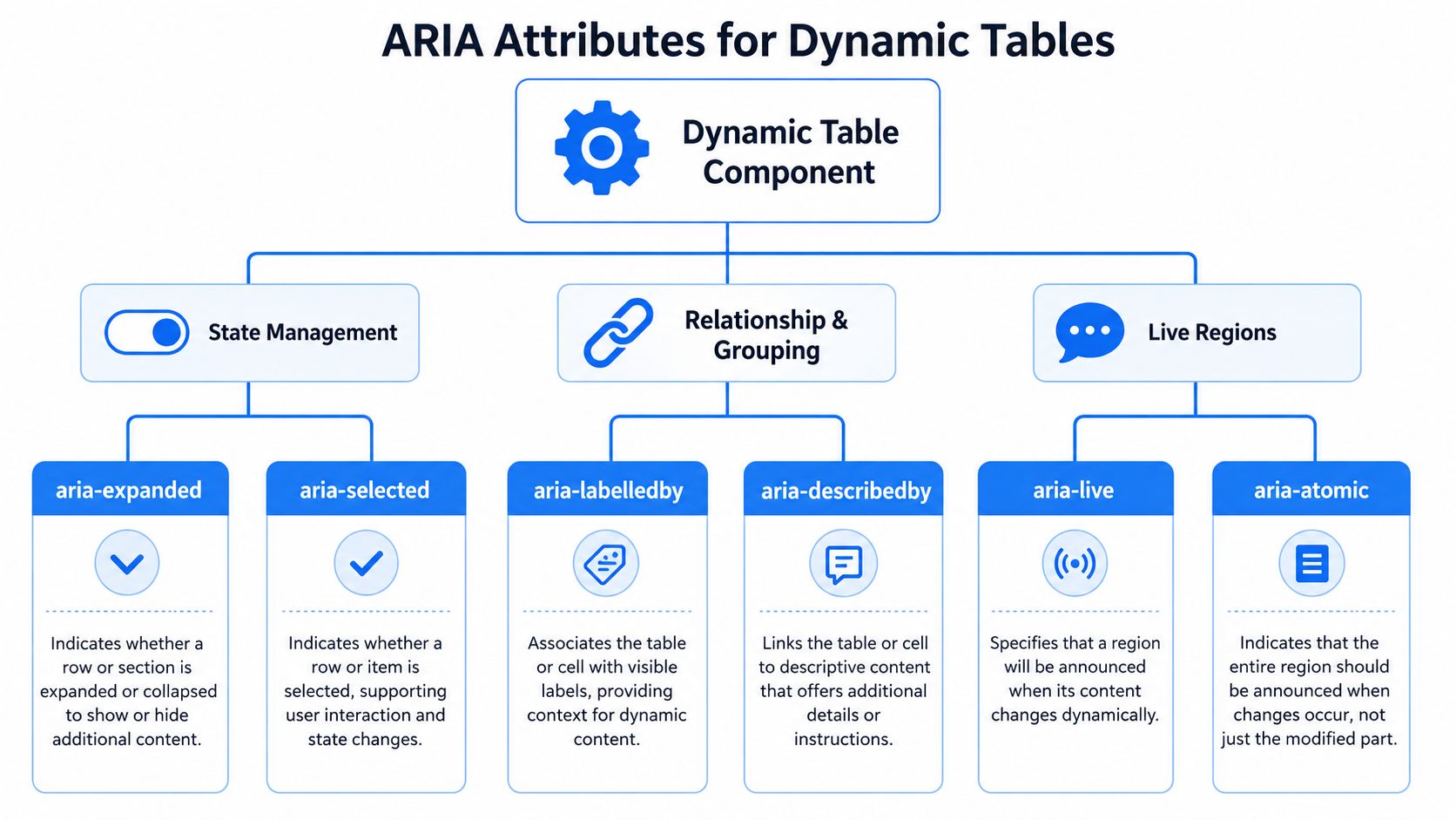
Once the table structure is correct, ARIA fills one job: it tells assistive technologies what changed.
That's where many implementations go off course. Teams either add too little and leave the expanded state invisible to screen-reader users, or they add too much ARIA and end up fighting the native semantics they already had.
The minimum ARIA that usually belongs here
For an expandable row, the core relationship is simple:
the button owns the interaction
aria-expandedexposes statearia-controlspoints to the content containerthe content container gets an
idthe content should have a clear accessible name when its purpose isn't obvious from the cell text alone
Collapsed state:
<button type="button" aria-expanded="false" aria-controls="details-1042" id="toggle-1042"> Show details </button> <tr id="details-1042" hidden> <td colspan="4"> <div role="region" aria-labelledby="order-1042 toggle-1042"> Shipment tracking, line items, and support actions </div> </td> </tr> Expanded state:
<button type="button" aria-expanded="true" aria-controls="details-1042" id="toggle-1042"> Hide details </button> <tr id="details-1042"> <td colspan="4"> <div role="region" aria-labelledby="order-1042 toggle-1042"> Shipment tracking, line items, and support actions </div> </td> </tr> The important part isn't the exact wording of the button label. It's that the state and the controlled content stay synchronized.
Use ARIA to clarify relationships, not replace HTML
A lot of mid-level codebases overuse ARIA roles on table descendants. Don't add role="table" to a real table. Don't turn every cell into a custom widget. ARIA is there to expose state and name regions when native semantics don't fully describe the dynamic behavior.
A good decision filter is this:
If HTML already communicates it, leave it alone.
If state changes after interaction, expose that state.
If expanded content lacks context, label it.
The WebAbility.io on ARIA benefits article is a useful reference for teams that need to standardize this principle across components.
The best ARIA implementation often feels minimal in code review. That usually means the HTML is doing its job.
Where WCAG 2.2 changes the engineering conversation
WCAG 2.2 added criteria aimed at real interaction bottlenecks, not surface polish. The W3C summary of what's new in WCAG 2.2 includes requirements around focus not being obscured and dragging interactions needing a single-pointer alternative. That matters for expandable rows because state changes must stay obvious and operable even when the UI gets more dynamic.
Developers usually feel this in three places:
Sticky UI can hide focus
A sticky table header or pinned action column can visually cover the focused button. If your focus ring disappears under a positioned element, the interaction becomes much harder to track.
Gesture-first patterns don't scale
Swipe-to-reveal or drag-to-expand interactions may feel efficient on touch devices, but they need a straightforward alternative that doesn't depend on motor precision.
Virtualized rows can desync state
If rows mount and unmount aggressively,
aria-controls, ids, and focus handling can drift unless the component owns stable identifiers.
A practical naming pattern
When the expanded content is substantial, treat it like a named region inside the details cell. The simplest pattern is usually:
row header id on the primary
<th scope="row">button id on the toggle
aria-labelledbyreferencing both
That way a screen reader user doesn't just hear “region.” They hear the row context plus the control context.
Ensuring Flawless Keyboard Navigation and Focus
Keyboard support is where an expandable table stops being a static artifact and becomes a usable component.
The rule is simple. A keyboard user should be able to reach the toggle, activate it, explore any newly revealed interactive content, collapse it, and continue through the page without losing orientation.
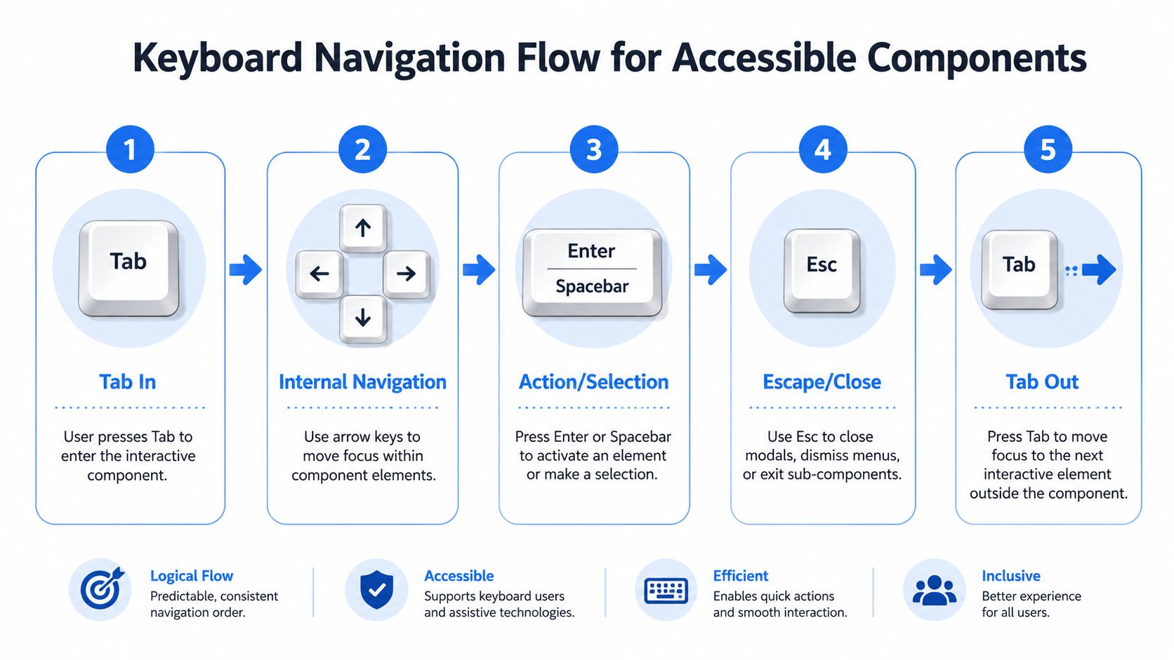
A visual map helps when you're reviewing your own behavior against expected flow.
The behavior users expect
For this pattern, the baseline interaction should be conventional:
Tab moves to the next toggle button in document order
Enter or Space expands or collapses the row
Tab after expansion moves into any interactive elements inside the revealed content
Escape can collapse the currently open row if your pattern supports it consistently
If your team needs a shared definition for this behavior, this guide to WCAG keyboard accessibility explained is a solid reference.
Here's the trade-off that comes up in reviews: should focus move into the revealed content automatically?
Keep focus on the button unless there's a strong reason not to
Most of the time, don't move focus after expansion. Let the user decide whether to continue into the details. This keeps the interaction predictable and avoids surprise jumps, especially in long tables.
Move focus only when the expansion reveals something that needs immediate attention, such as:
an inline error summary
a form field the user must complete next
a confirmation area with a clear next action
Field note: automatic focus movement feels efficient in demos and often feels disruptive in production.
This section's video is a useful reminder of how much keyboard flow affects the whole experience, not just compliance.
Focus visibility matters more than teams expect
Expandable rows often sit inside dense layouts with sticky headers, zebra striping, hover effects, and clipped overflow. That combination can make a perfectly valid focused button hard to see.
Check these failure points in real UI states:
| Issue | What it looks like | Better approach |
|---|---|---|
| Focus ring clipped | Parent container uses overflow: hidden | Leave room for outline or use inset focus styling carefully |
| Focus hidden by sticky header | Scrolling brings item under fixed chrome | Add scroll margin or adjust scroll logic |
| Hover style stronger than focus style | Mouse state dominates keyboard state | Give focus a distinct visual treatment |
The goal isn't flashy styling. It's certainty. A keyboard user should always know where they are.
Don't over-engineer internal navigation
Developers sometimes add arrow-key roving focus inside table rows because it feels “app-like.” For a standard data table with row-level buttons, that usually adds complexity without helping.
Stick with native tab order unless you're building a true composite widget. Expandable rows usually don't need custom arrow-key navigation. They need reliable buttons, visible focus, and escape hatches that behave consistently.
Graceful Animations and Responsive Design
Accessibility doesn't mean the component has to feel stiff. It means motion and layout changes have to respect user control.
Expandable rows are a good place to prove that. The same pattern can feel polished on desktop, usable on touch, and calm for users who are sensitive to movement. That only happens if animation is treated as enhancement, not as the mechanism that makes the UI understandable.
Animate height carefully and never hide the state in motion
A short expand or collapse transition can help sighted users track what just changed. But the state must still be clear without the animation. If the only cue is a sliding panel, users who disable motion or interact using a screen reader lose the context.
A practical CSS pattern looks like this:
.details-panel { overflow: clip; transition: block-size 180ms ease, opacity 180ms ease; } @media (prefers-reduced-motion: reduce) { .details-panel { transition: none; } } The key point is behavioral, not aesthetic. If reduced motion is enabled, the panel should open and close cleanly with no reliance on animated cues.
Motion should support orientation. It shouldn't be required to understand whether content exists.
Mobile often needs a different component, not a squeezed table
Teams often get stubborn. They keep the desktop table on small screens, stack cells awkwardly, and leave the row-expansion pattern intact even when the content no longer reads like a table.
For many mobile layouts, a card or list pattern works better. Each record becomes a compact summary with a details toggle. You still preserve the same accessibility principles, but you stop forcing horizontal data relationships into a cramped viewport.
That decision also lines up with newer WCAG 2.2 usability expectations. The UsableNet overview of WCAG 2.2 additions highlights criteria such as Focus Not Obscured and Target Size Minimum, which directly affect mobile users, low-vision users, and people with cognitive or motor disabilities.
Target size is a UX issue, not just a guideline issue
If your expand icon is tiny, users will miss it, tap the wrong thing, or avoid it entirely. This is common in dense admin tables where the toggle is reduced to a chevron with almost no hit area.
A better pattern includes:
A larger interactive area even if the icon itself stays visually compact
Clear separation between adjacent buttons like edit, delete, and expand
Consistent placement so users don't have to hunt from row to row
There's a product trade-off here. Larger touch targets take space. But the space cost is usually lower than the usability cost of accidental taps and hidden affordances.
Responsive behavior should preserve meaning
On desktop, users scan columns. On mobile, they scan records. That means your content hierarchy has to shift.
When adapting the component, preserve these anchors:
the row's primary identifier
the action to reveal more detail
the relationship between summary content and expanded content
If those stay clear, the implementation can change shape without losing accessibility.
Implementation in Modern JavaScript Frameworks
Frameworks don't make this pattern harder by themselves. What causes trouble is when abstraction hides the DOM relationships you need to preserve.
In both React and Vue, the safest approach is the same. Keep the table semantics in the rendered output. Generate stable ids. Bind ARIA directly from component state. Don't let animation wrappers or conditional rendering break the relationship between the button and the details row.
React pattern that stays readable
In React, a row component usually needs three things: a stable row id, expansion state, and an optional ref if you plan to manage focus intentionally.
import { useId, useState, useRef } from "react"; function OrderRow({ order }) { const generatedId = useId(); const rowId = `order-${generatedId}`; const detailsId = `details-${generatedId}`; const buttonRef = useRef(null); const [isExpanded, setIsExpanded] = useState(false); return ( <> <tr> <th scope="row" id={rowId}>{order.number}</th> <td>{order.customer}</td> <td>{order.status}</td> <td> <button ref={buttonRef} type="button" aria-expanded={isExpanded} aria-controls={detailsId} onClick={() => setIsExpanded(v => !v)} onKeyDown={(e) => { if (e.key === "Escape" && isExpanded) { setIsExpanded(false); } }} > {isExpanded ? "Hide details" : "Show details"} </button> </td> </tr> {isExpanded && ( <tr id={detailsId}> <td colSpan={4}> <div role="region" aria-labelledby={rowId}> {order.details} </div> </td> </tr> )} </> ); } The main thing to watch in React is id stability. If the list reorders or rows remount, uncontrolled id generation can create confusing control relationships. Tying ids to persistent row identity is safer than deriving them from array index.
Vue pattern that avoids stale state
In Vue, this reads cleanly with bound attributes and either v-if or v-show.
<template> <> <tr> <th :id="rowId" scope="row">{{ order.number }}</th> <td>{{ order.customer }}</td> <td>{{ order.status }}</td> <td> <button type="button" :aria-expanded="isExpanded.toString()" :aria-controls="detailsId" @click="isExpanded = !isExpanded" @keydown.esc="isExpanded = false" > {{ isExpanded ? 'Hide details' : 'Show details' }} </button> </td> </tr> <tr v-if="isExpanded" :id="detailsId"> <td colspan="4"> <div role="region" :aria-labelledby="rowId"> {{ order.details }} </div> </td> </tr> </> </template> <script setup> import { ref } from 'vue' const props = defineProps({ order: Object, rowId: String, detailsId: String }) const isExpanded = ref(false) </script> The key trade-off in Vue is v-if versus v-show.
Use
v-ifwhen the details content is heavy and you want to avoid mounting it until needed.Use
v-showwhen preserving DOM presence helps with transitions or embedded state.
Neither is automatically more accessible. The right choice depends on whether the DOM should exist while hidden and whether that affects performance or focus handling.
Reusable components need governance, not just props
Once this pattern lands in a design system, regressions usually come from reuse. Someone swaps the button for an icon wrapper. Someone removes the row header. Someone adds virtualization and forgets focus handling.
That's where tooling matters. Teams often combine component-level checks with scanners such as axe-core in Storybook, Lighthouse in CI, or dashboard-based monitoring. In larger programs, WebAbility.io is one option that provides scanning, reporting, and workflow support mapped to WCAG criteria, which can help teams track whether reusable components keep passing as they evolve.
The useful mindset is simple: the component API should make the accessible pattern the default path, not the optional one.
Bulletproof Testing for WCAG 2.2 Verification
A compliant-looking expandable row can still fail in use. Testing has to cover the rendered markup, the interaction model, and the assistive technology experience.
The W3C WCAG standards guidance notes that WCAG 2.2 adds 9 new success criteria, and a practical workflow includes baselining against A and AA criteria, prioritizing the newer keyboard and touch-related checks, and validating with manual assistive-technology testing.
A practical verification stack
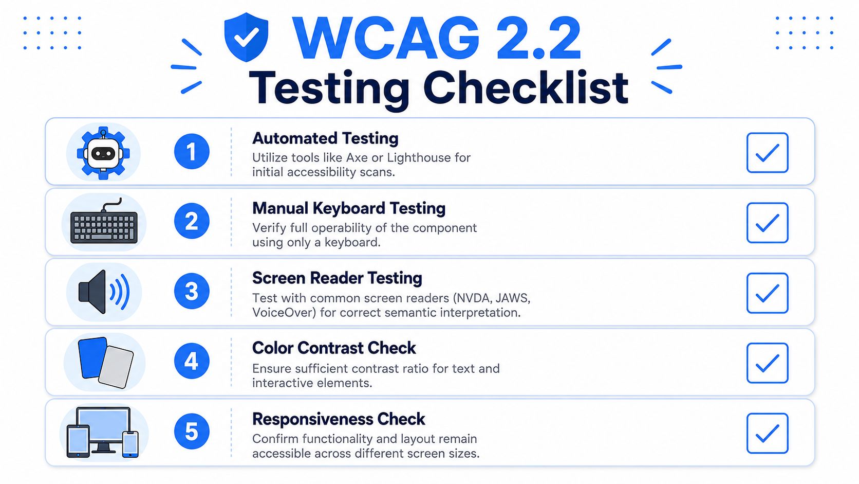
Use at least three layers:
Automated checks with axe-core, Storybook accessibility add-ons, or Lighthouse. These catch missing labels, broken relationships, and obvious structural issues.
Manual keyboard testing to confirm tab order, activation, visible focus, and collapse behavior.
Screen reader testing with NVDA, JAWS, or VoiceOver to hear whether the row, button, and details region make sense together.
For quick early checks, a wcag compliance checker can help catch common issues before deeper review.
What to verify before shipping
Keep the checklist short and strict:
State accuracy. Does the button announce expanded and collapsed states correctly?
Relationship clarity. Does the details area have enough context when read out of sequence?
Keyboard continuity. Can a user expand, move through revealed controls, and continue without getting trapped?
Visual resilience. Does focus remain visible during scrolling, sticky layouts, and responsive states?
Reuse safety. If this row pattern appears in multiple views, does the same markup contract hold everywhere?
If a component passes automation but fails a real keyboard or screen-reader flow, it isn't verified. It's partially checked.
Web accessibility works best when teams can combine component-level engineering with repeatable monitoring and remediation workflows. If you need a platform to support that process, WebAbility.io provides accessibility testing, scanning, and compliance support for ongoing WCAG 2.2 efforts.
Quick Questions
Tap to ask AI about this article