Build a Better Accessibility Color Palette From Scratch

Sidharth Nayyar

TLDR: An accessible color palette ensures your website is usable for everyone, including people with visual impairments. The key is color contrast. Follow WCAG AA guidelines: a 4.5:1 contrast ratio for normal text and 3:1 for large text and UI elements like icons and buttons. Use tools to simulate color blindness and test your palette. Document your colors with functional names (e.g., `color-text-primary`) in a design system to ensure consistent, accessible implementation across your team.
When we talk about an accessible color palette, we're really talking about making sure your design works for everyone, especially people with visual impairments. It all boils down to one key concept: contrast. This means picking colors for text and interface elements that stand out clearly against their background, guided by the Web Content Accessibility Guidelines (WCAG). These aren't just suggestions; they're the bedrock of inclusive design.
The Quick Guide to Accessible Colors
Before you get lost in design systems and complex testing tools, let's get the fundamentals right. The mission is simple: choose color combinations that are easy to read and see. This isn't about stifling your creativity—it's about making deliberate, functional choices that ensure usability from the very beginning.
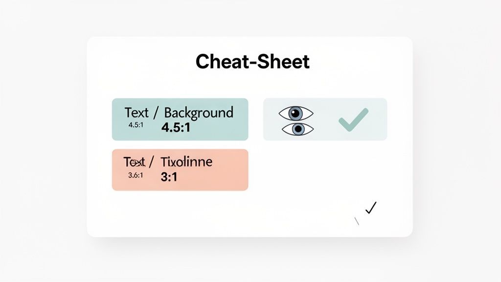
Think of this as your starting point for understanding the WCAG contrast ratios that matter most. We'll get into more advanced strategies later, but nailing these basics is crucial. To see how color fits into the bigger picture, it's worth reading a solid guide to website accessibility compliance.
Core WCAG Contrast Ratios
While WCAG has a few conformance levels, Level AA is the one you need to focus on. It’s the standard that most legal and business requirements are built on.
Here are the non-negotiable thresholds to memorize:
- Normal Text: This is most of your body copy. It needs a contrast ratio of at least 4.5:1.
- Large Text: For text that’s bigger (18pt / 24px or larger, or 14pt / 18.5px and bold), the requirement is a bit more relaxed at 3:1.
- UI Components & Graphics: It’s not just about text. Icons, buttons, and other interactive elements must also have a 3:1 contrast ratio against their surroundings to be clearly visible.
I’ve found that keeping a simple reference handy is incredibly helpful for quick checks during the design process. Here's a table that breaks down the WCAG 2.2 AA requirements.
WCAG 2.2 AA Contrast Ratio Cheatsheet
| Content Type | Minimum Contrast Ratio | Why It Matters |
|---|---|---|
| Normal Text | 4.5:1 | Ensures body copy is legible for users with moderate low vision. |
| Large Text | 3:1 | Larger font sizes are inherently easier to read, so they require less contrast. |
| UI Components | 3:1 | Allows users to distinguish interactive elements like buttons and form fields. |
| Graphical Objects | 3:1 | Applies to essential parts of charts, graphs, and icons. |
These ratios aren't arbitrary numbers; they are based on research into how people with different levels of vision perceive color and light. Meeting these minimums is the first, most critical step toward building an experience that doesn't shut people out.
If you want to dig deeper into the science and application of these ratios, we've covered the nuances of https://www.webability.io/blog/color-contrast-accessibility in another article.
Why Your Color Palette Matters More Than You Think
Let's cut to the chase: an accessible color palette isn't a "nice-to-have." It's an absolute must for a good user experience and, frankly, for legal reasons. Poor color contrast is the single most common web accessibility failure, and it doesn't just annoy users—it locks millions of them out of your product and opens your company up to serious legal trouble.
Following the Web Content Accessibility Guidelines (WCAG) isn't just about ticking a box. It's a core business decision that makes sure what you build is actually usable for as many people as possible.
An accessible color palette is all about function, not just form. Designers naturally gravitate toward colors that look good together, but the real measure of success is whether those colors work for everyone. This includes people with low vision, color vision deficiency (CVD), or even just someone trying to use their phone in bright sunlight.
For so many people, low-contrast designs are simply broken. Imagine trying to spot a light gray button on a white background or read a crucial error message that barely stands out. This is a daily frustration that turns simple online tasks into a massive headache.
Building on a Foundation of Inclusion
To make sure our designs are truly functional, we need to lean on the Web Content Accessibility Guidelines (WCAG). These aren't just vague suggestions; they provide a clear, testable set of standards for digital accessibility. For most businesses, hitting Level AA conformance is the goal line for both legal and practical reasons.
The official W3C Quick Reference guide shows how these standards are organized, breaking down complex rules into principles you can actually work with.
This structure helps teams make sense of the guidelines, turning abstract rules for an accessibility color palette into something concrete and actionable.
The Real Cost of Getting it Wrong
Ignoring these standards is a risky move. Low color contrast is, by a huge margin, the most common accessibility mistake on the internet today.
A staggering 83.6% of all websites analyzed in WebAIM's 2024 Million report failed on color contrast, making it the number one accessibility issue on the web.
This isn't just a user experience problem; it's a legal one. In 2024, 4,605 ADA lawsuits were filed in the US. A whopping 73% of them pointed directly to failures in meeting WCAG 2.1 AA standards, with low contrast being the most common complaint. You can discover more insights about these accessibility statistics and see why this is so critical for businesses to address.
Ultimately, getting your color palette right is a business imperative. It’s where the technical rules of WCAG meet the real people you’re trying to serve, helping you sidestep major legal risks while creating a more inclusive product.
Crafting Your Accessible Brand Palette
Alright, let's get practical. Moving from theory to action means weaving accessibility right into your creative workflow. Building an accessible brand palette isn't about boxing yourself in or stifling creativity; it’s about making smart, intentional choices so your design is both beautiful and usable for everyone. The end goal is a system where every color has a clear purpose and meets contrast standards right out of the gate.
This is more than just picking a few colors that look nice side-by-side. It's a strategic process. You're defining a color system that actively supports usability, reinforces your brand identity, and shields you from very real legal and business risks.
The flowchart below breaks down why this is so critical, connecting the dots between the human impact of your choices and the solid business case for getting it right.
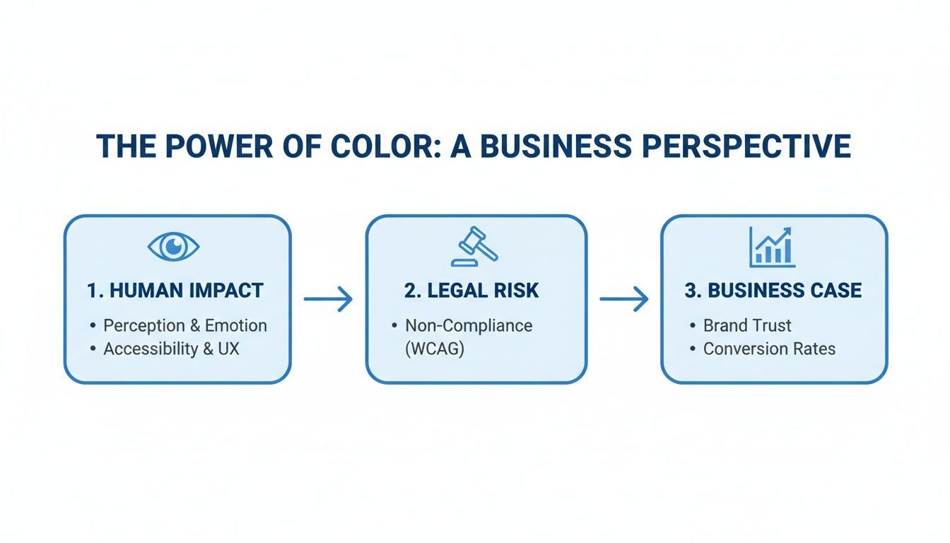
As you can see, the colors you choose have a direct line to user experience, legal compliance, and your bottom line.
Define Your Core Brand Colors
First things first: identify your primary and secondary brand colors. These are the workhorses of your visual identity. If you're starting with an existing palette, now's the time for a quick audit. Throw your primary colors against both white and black backgrounds and see how they hold up on a contrast checker.
Don't panic if one of your core brand colors fails a contrast test for text. Seriously. It doesn't mean you have to ditch it.
- Primary Action Color: Find a vibrant, high-contrast color that will serve as your go-to for crucial calls-to-action and interactive elements. This is your "click me" color.
- Secondary Colors: These play a supporting role. Think secondary buttons, informational tags, or other components that need to stand out but aren't the main event.
- Neutral Palette: You'll need a solid range of grays. Here's a pro-tip I've picked up: instead of using pure, flat grays, create them by slightly desaturating your primary or secondary colors. This little trick makes your neutral tones feel much more cohesive and on-brand.
Thinking about your palette is also a perfect time to consider creating a cohesive theme for your app UI, which ensures all these color decisions translate into a consistent experience across every screen.
Build a Full Spectrum of Tints and Shades
With your base colors locked in, it's time to build out a full, functional palette. For each core color, generate a spectrum of lighter tints and darker shades. The secret here is to create pairs that are designed to work together. For instance, your darkest shade of blue should have at least a 4.5:1 contrast ratio against its lightest tint, making them a pre-approved, accessible combination.
I've always found it helpful to lean on the Web Content Accessibility Guidelines (WCAG) as a north star. The guidelines provide clear, enforceable benchmarks. Level AA's 4.5:1 contrast ratio for normal text and 3:1 for large text or UI graphics have become the gold standard for a reason. Hitting these numbers ensures legibility for low-vision users—a group that includes an estimated 26% of US adults—and keeps you aligned with major accessibility laws.
Assign Semantic Roles to Your Colors
An accessible color palette really comes to life when it becomes semantic. This is where you stop thinking about "dark blue" and start thinking in terms of function. By assigning specific roles to your colors, you turn them into design tokens.
color-background-primary: This is your main page background. Simple.color-text-default: The go-to for all your standard body copy.color-interactive-default: The primary color for buttons, links, and anything else a user can interact with.color-state-error: A high-contrast color reserved for error messages and alerts.color-state-success: A color that clearly signals a successful action.
This system does two amazing things. First, it makes your UI incredibly predictable and consistent for users. Second, it makes maintenance a breeze. Need to update your primary action color? Just change the color-interactive-default token, and that update will cascade everywhere it's used. This is a crucial step, and ensuring you create a https://www.webability.io/blog/colorblind-friendly-palette from the start will make your semantic choices truly inclusive.
Testing Your Palette in Real-World Scenarios
A color palette that looks great on paper (or in Figma) is one thing, but how it holds up in the real world is another story entirely. Simply passing a contrast checker isn't enough. To truly understand if your palette works, you have to move beyond the theoretical and see it through the eyes of different users in various situations.
This is where the rubber meets the road. We need to simulate different forms of color blindness, strip away all color to test for clarity, and even see how our designs perform on a smudgy phone screen under the bright sun. These aren't just extra steps for compliance; they're essential for building something genuinely usable for everyone.
Think about it this way: a color blindness simulator can instantly show you how your carefully chosen palette might look to someone with Protanopia. What was once a vibrant, clear design can become a confusing mess.
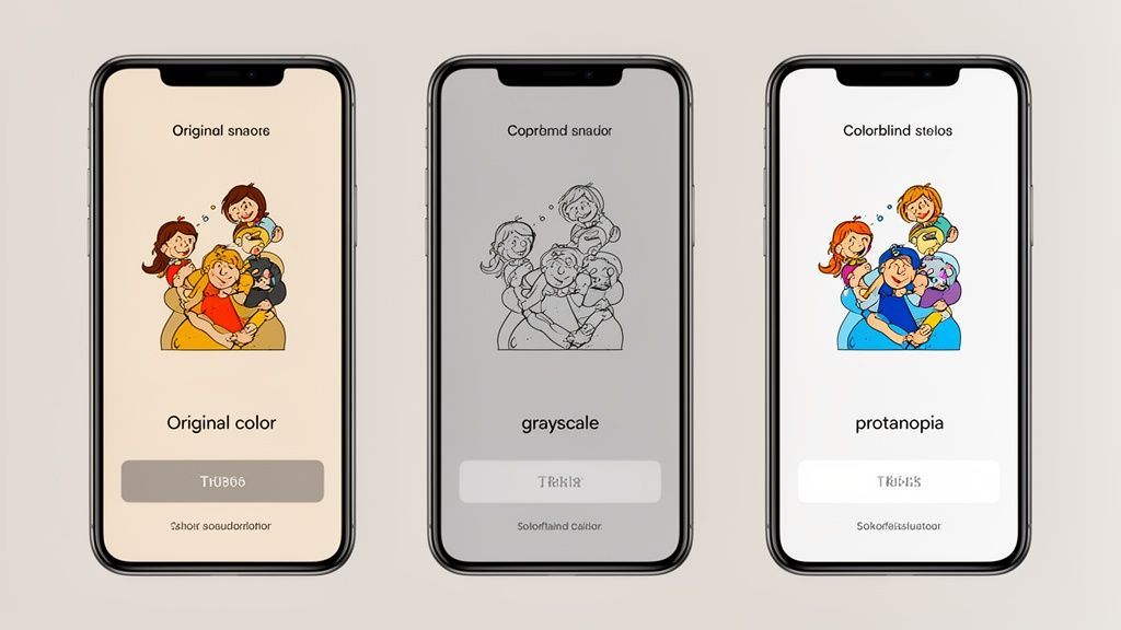
This kind of simulation drives home the point that relying on color alone to convey meaning is a recipe for exclusion. When colors shift and blend, critical information can get lost.
Simulating Color Vision Deficiency
It’s easy to forget that a significant number of people see the world—and your interface—in a completely different spectrum of colors. That's why running your designs through a color vision deficiency (CVD) simulator is one of the most eye-opening tests you can perform.
Around 300 million people worldwide live with some form of color vision deficiency. That's roughly 4% of the global population, affecting 1 in 12 men and 1 in 200 women. The vast majority of these cases, about 98%, are red-green deficiencies.
These numbers are why the standard red for "error" and green for "success" can be so problematic. For users with protanopia or deuteranopia, those two colors can look virtually identical, making your UI's feedback system useless.
Fortunately, there are some great tools to help you catch these issues early:
- Browser Extensions: Tools like Stark and Colorblindly let you overlay CVD filters on any live website right in your browser. It’s a fast and effective way to audit your work.
- Design Plugins: You can find powerful plugins for tools like Figma that apply these simulations directly to your mockups, allowing you to fix problems long before a developer writes a single line of code.
Getting a handle on how users with CVD perceive your designs is a game-changer. For a much deeper look at this, check out our guide on what colorblind people see and how you can design more inclusively.
The Grayscale Test
Here’s one of my favorite gut checks for any design: switch it to grayscale. This simple trick is incredibly revealing. It forces you to see if your design's hierarchy and meaning hold up without any color cues.
If you can still easily navigate the interface, distinguish between buttons and links, and understand which elements are active, you're in great shape. It's a clear sign that your design is built on a solid foundation of contrast, shape, and spacing—not just a pretty coat of paint.
Testing on Different Devices and Environments
Finally, remember that your pristine design monitor is not the real world. A palette that looks perfect in your office can become completely unusable on a low-quality laptop screen or a smartphone in direct sunlight.
This is why you have to get your hands dirty. Test your palette on different devices, from the latest iPhone to an older Android with a less-than-perfect screen. Take it outside. Look at it under harsh fluorescent lights. These environmental factors can drastically alter how colors appear, and catching these issues is what separates a merely compliant palette from one that's truly user-friendly.
How to Document and Scale Your Palette
An accessible color palette is only as good as its implementation. If designers start eyeballing hex codes or developers hardcode one-off colors, the entire system you’ve painstakingly built will quickly fall apart.
That's why documenting your palette and creating a scalable system isn't just a "nice-to-have"—it's the only way to make your work stick.
The goal here is to build a single source of truth that connects design and development. When the accessible choice is the easiest choice, you’ve set your team up for success. Without that bridge, even the most carefully crafted palette will degrade over time.
Think in Roles, Not Hues: The Power of Semantic Naming
The most critical shift you can make is to stop naming colors based on what they look like (e.g., "light-blue-200") and start naming them based on what they do. This is the core idea behind design tokens—giving each color a specific job description.
When you name colors based on their function, the system becomes instantly intuitive. It removes the guesswork and makes it far easier to maintain consistency, especially as new people join the team or the product expands.
Here’s what this looks like in practice:
color-text-primary: The go-to color for most body copy.color-text-inverse: Used for text on dark or inverted backgrounds.color-background-action: The background for primary buttons and calls-to-action.color-border-interactive-focus: The outline style for a focused input or button.color-state-error: Reserved exclusively for error messages or destructive actions.
This approach makes your design system incredibly resilient. Need to update your brand’s primary blue? You just change the value of the color-background-action token, and that change ripples through the entire application automatically. No hunting down hex codes.
Your Documentation: The Official Rulebook
Great documentation is more than just a grid of color swatches. It needs to be an actionable guide that shows people how to use the palette correctly.
One of the most valuable assets you can create is a contrast grid. This simple matrix shows every possible text and background color combination, clearly marking which pairings pass WCAG contrast requirements. It’s a visual cheat sheet that helps designers make compliant choices instantly. Plugins like Figma's Contrast Grid can even generate this for you.
Your documentation is the rulebook for your accessibility color palette. It should explicitly state approved text-on-background pairings, define hover and focus state colors, and provide do's and don'ts with real examples. This preempts guesswork and prevents inaccessible combinations from ever making it into production.
Bringing it to Life with Code
With your tokens defined, the final step is to wire them into your codebase. CSS Custom Properties (often called CSS variables) are the perfect technology for this, as they create a one-to-one mapping with your design tokens.
This creates a living link between your design system and the final product. Here’s a basic example of what this looks like in your CSS:
:root {
/* Text Colors */
--color-text-primary: #1A1A1A;
--color-text-secondary: #555555;
/* Background Colors */
--color-background-page: #FFFFFF;
--color-background-action: #005A9C;
/* State Colors */
--color-state-error: #D93025;
}
body {
color: var(--color-text-primary);
background-color: var(--color-background-page);
}
.button-primary {
background-color: var(--color-background-action);
color: var(--color-background-page); /* Assumes this combo passes */
}
This setup is incredibly powerful. When a token’s value is updated in the design system, a developer only has to change a single line of code in the :root to apply it everywhere. It’s the secret to maintaining a truly scalable and accessible color system for the long haul.
Answering Your Questions About Accessible Palettes
Once you start digging into accessible color, a lot of practical questions come up. It's one thing to know the rules, but it’s another to apply them to a real-world design system. Let's tackle some of the most common hurdles designers and developers face when building and maintaining an inclusive color palette.
Think of this as the troubleshooting guide—the part where we address the tricky situations that inevitably pop up.
What Are the Most Common Mistakes to Avoid?
I see teams run into the same few pitfalls over and over. The biggest one is definitely relying on color alone to communicate something important. A classic example is making an error message just red text. If a user has red-green color blindness, that error might as well be invisible. You always need a secondary indicator, like an icon or a clear text label.
Another common misstep is getting locked into brand colors with inherently poor contrast. When the marketing team hands you a beautiful light gray or pastel blue and says, "This is our primary color," it can force you into tough spots later on. It's so much easier to have the accessibility conversation upfront and create accessible variants from day one.
Finally, people often forget about interactive states. They're not just decorative; they're functional.
- Hover states need a noticeable change.
- Focus states are non-negotiable for keyboard navigation and have to be crystal clear.
- Disabled elements shouldn't just fade into the background. They still need to be perceptible, and it's a good practice to aim for at least a 3:1 contrast ratio for them.
Can I Still Use Brand Colors That Fail Contrast Ratios?
Yes, absolutely! You just have to be smart about where you use them. If a primary brand color doesn't hit that crucial 4.5:1 text contrast ratio, the solution is simple: don't use it for text. Or icons. Or form field borders.
Your brand colors can still be a huge part of your design. Use them for decorative backgrounds, large hero graphics, or as accents where they aren't communicating essential information. This lets you keep the brand's vibe without compromising usability.
The best strategy is to create an "accessible" version of that color. If your official brand blue is too light for text, define a darker "accessible blue" in your design system that meets WCAG standards. This new shade becomes the go-to for all functional UI components, giving you the best of both worlds: brand recognition and rock-solid accessibility.
What Is the Difference Between WCAG AA and AAA Contrast?
Getting your head around the AA and AAA levels is key to setting achievable goals for your color system.
- WCAG Level AA is the industry standard. It's what most accessibility laws and regulations point to. It requires a 4.5:1 contrast ratio for normal-sized text and 3:1 for large text (which is typically 18pt/24px or 14pt/18.5px if it's bold).
- WCAG Level AAA is the gold standard. It’s much more stringent, demanding a 7:1 ratio for normal text and 4.5:1 for large text.
Honestly, hitting full AAA compliance across an entire complex website is incredibly difficult. But it provides a far better experience for users with low vision.
A great, pragmatic approach is to mandate AA compliance for everything, but aim for AAA wherever you can, especially for long blocks of body text. This hybrid approach ensures you're compliant while pushing for the best possible readability.
Ready to build an inclusive digital experience without the guesswork? WebAbility.io offers a complete suite of tools, from our AI-enhanced Accessibility Widget to real-time compliance monitoring, helping you achieve and maintain WCAG 2.1 AA standards effortlessly. Discover how our platform can reduce legal risk and improve user experience for everyone at https://www.webability.io.
Quick Questions
Tap to ask AI about this article