The Complete WCAG 2.1 AA Checklist for Web Accessibility

Sidharth Nayyar
TLDR: This guide is a comprehensive WCAG 2.1 AA checklist, breaking down the 50 success criteria into actionable steps. It's organized under the four core principles of accessibility: Perceivable, Operable, Understandable, and Robust (POUR). Use this checklist to understand key requirements like text alternatives, color contrast, keyboard navigation, and clean code to make your website compliant and accessible to everyone.
Think of a WCAG 2.1 AA checklist as your essential roadmap for making sure a website or application meets the gold standard for digital accessibility. It’s a structured guide that translates the technical requirements into a set of clear pass/fail checks, all organized under four core principles: Perceivable, Operable, Understandable, and Robust (POUR).
This framework gives developers, designers, and content creators a practical way to build and test for inclusivity.
Your Quick-Reference WCAG 2.1 AA Checklist
Getting to WCAG 2.1 AA compliance might feel like a huge undertaking, but at its heart, it's about one thing: making your digital content work for everyone. The guidelines are laid out in a logical hierarchy that makes the whole process manageable.
It all starts with those four main principles. From there, they branch out into guidelines, which then break down into specific, testable success criteria. This structure is key to organizing your accessibility work effectively.
The infographic below gives you a great visual of how the 50 success criteria for WCAG 2.1 Level AA fit together.
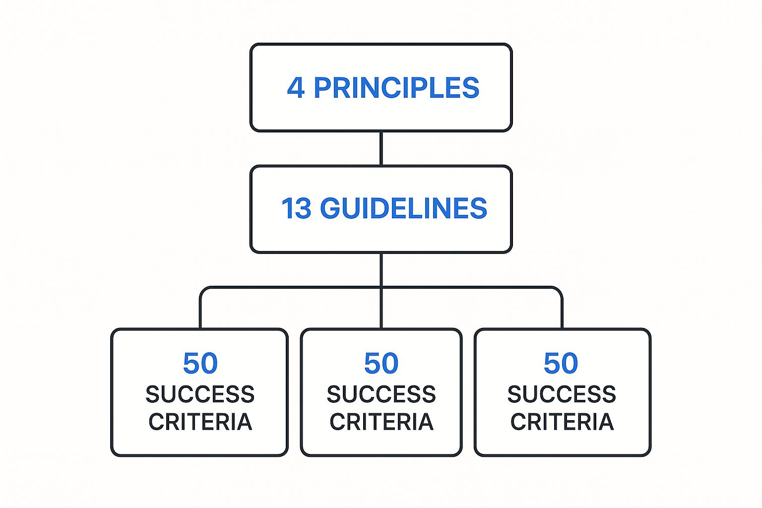
As you can see, a handful of high-level concepts flow down into very specific, actionable items. This design helps teams approach accessibility systematically, tackling one principle at a time.
WCAG 2.1 AA Principles at a Glance
Before we jump into the full checklist, it's helpful to get a quick overview of what each of the four POUR principles is all about.
| Principle | Core Goal | Key Areas Covered |
|---|---|---|
| Perceivable | Users must be able to perceive the information being presented. It can't be invisible to all of their senses. | Text alternatives for images, captions for video, color contrast, and resizable text. |
| Operable | Users must be able to operate the interface. The interface cannot require interaction that a user cannot perform. | Keyboard-only navigation, sufficient time to read and use content, and avoiding content that can cause seizures. |
| Understandable | Users must be able to understand the information as well as the operation of the user interface. | Readability, predictable navigation, and input assistance to help users avoid and correct mistakes. |
| Robust | Content must be robust enough that it can be interpreted reliably by a wide variety of user agents, including assistive technologies. | Clean code, proper use of HTML tags, and ensuring compatibility with screen readers and other assistive tools. |
These principles are the foundation of everything that follows.
If you want a quick snapshot of where your site stands right now, running a scan with a free WCAG checker is a great starting point. From here, this guide will walk you through each criterion, turning those abstract principles into a clear, step-by-step plan for building a truly inclusive website.
Diving Into the Perceivable Principle Checklist
The Perceivable principle is the first and, arguably, the most fundamental pillar of the WCAG 2.1 AA checklist. It’s all about a simple, powerful idea: information and interface components must be presented to users in ways they can actually perceive. If a user can't see it, hear it, or touch it, it simply doesn't exist for them.
Think of it this way: someone who is blind can't perceive an image without a text alternative, and someone who is deaf misses out entirely on a podcast without a transcript. This principle is our starting point for making sure nothing on your website is invisible to any of your users' senses.

Guideline 1.1 Text Alternatives
At its core, this guideline is about one thing: giving a text-based equivalent for any non-text content. This is a lifeline for people using screen readers or other assistive technologies that translate text into speech or braille.
1.1.1 Non-text Content (Level A)
- Check: Do all images, icons, and charts have a text alternative, like alt text?
- Why it matters: A screen reader announces the alt text, describing the image to someone with a visual impairment. Without it, you leave a gap in their understanding and create a frustrating experience.
- Implementation Tips:
- Informative Images: Be descriptive.
alt="A golden retriever catching a red frisbee in a park"is far better thanalt="dog". - Decorative Images: If an image is purely for looks, use an empty alt attribute (
alt=""). This tells screen readers to skip it, reducing unnecessary noise. - Functional Images (like icons or buttons): The alt text needs to describe the action. For a magnifying glass icon, use
alt="Search".
- Informative Images: Be descriptive.
Guideline 1.2 Time-based Media
This part of the checklist deals with anything that plays over time, like audio and video. The goal here is to make sure people who can't hear the audio or see the video can still access the same information.
1.2.1 Audio-only and Video-only (Prerecorded) (Level A)
- Check: Is there a transcript for prerecorded audio-only media (like a podcast)? For silent videos, is there a transcript or a descriptive audio track?
- Why it matters: Transcripts are essential for users who are deaf or hard of hearing to read the content.
1.2.2 Captions (Prerecorded) (Level A)
- Check: Are synchronized captions available for all prerecorded videos that contain audio?
- Why it matters: Captions aren't just for users who are deaf or hard of hearing. They also help people in noisy environments or those who may not be native speakers.
1.2.4 Captions (Live) (Level AA)
- Check: Are captions provided for all live audio events, such as webinars or livestreams?
- Why it matters: This ensures your live events are inclusive and accessible to a much wider audience in real-time.
1.2.5 Audio Description (Prerecorded) (Level AA)
- Check: Is an audio description available for prerecorded video content?
- Why it matters: Think of audio descriptions as a narrator for your video. This separate audio track explains key visual details—like actions, scene changes, or character expressions—that someone with a visual impairment would otherwise miss.
Guideline 1.3 Adaptable
Your content needs to be flexible. It must be built in a way that allows it to be presented differently without losing information or structure. This helps people who need to customize their view and is critical for assistive technologies that interpret your site's underlying code.
1.3.1 Info and Relationships (Level A)
- Check: Is the content's structure—headings, lists, tables—defined in the code?
- Why it matters: Using proper HTML tags like
<h1>,<ul>, and<table>lets screen readers announce the page structure, which is how users navigate. Just making text bold doesn't make it a heading to a screen reader.
1.3.4 Orientation (Level AA)
- Check: Does your website work properly in both portrait and landscape modes?
- Why it matters: Some users have their devices mounted in a fixed position, perhaps on a wheelchair. Forcing a specific orientation can make your content completely unusable for them.
Guideline 1.4 Distinguishable
This is a big one. This guideline ensures that your content is easy for people to see and hear. It covers everything from color contrast to text size, making sure what you've created is actually legible and understandable.
Getting this right isn't just a design choice; it's a fundamental requirement. Failing to meet minimum contrast ratios is one of the most common accessibility blunders, and it instantly shuts out users with low vision or color blindness.
1.4.3 Contrast (Minimum) (Level AA)
- Check: Does your regular text have a contrast ratio of at least 4.5:1 against its background? For large text (18pt or 14pt bold), is the ratio at least 3:1?
- Why it matters: Good contrast is essential for people with low vision and color vision deficiencies. You can easily check your color palettes with a good online WCAG contrast checker.
1.4.4 Resize Text (Level AA)
- Check: Can users zoom in on text up to 200% without breaking the layout, losing content, or being forced to scroll horizontally?
- Why it matters: Many people with low vision need to significantly increase text size to read comfortably. A well-built responsive design is the key to passing this checkpoint.
1.4.5 Images of Text (Level AA)
- Check: Have you avoided using images of text wherever possible?
- Why it matters: A screen reader can't read text that's part of an image, and the user can't resize or customize it. The only real exceptions are for logos or when a very specific visual presentation is absolutely essential to the information.
1.4.10 Reflow (Level AA)
- Check: When a user zooms in to 400% on a 1280px wide screen, does the content reflow into a single column without requiring horizontal scrolling?
- Why it matters: This is huge for users who magnify their screens. It prevents the disorienting "left-right shuffle" of scrolling back and forth just to read a single line of text.
1.4.11 Non-text Contrast (Level AA)
- Check: Do your UI components (like button borders and form fields) and essential graphics have a contrast ratio of at least 3:1 against their surroundings?
- Why it matters: This extends the contrast rules beyond just text. It ensures that everyone can actually see and identify the interactive parts of your page and understand important visual information.
Your Checklist for the Operable Principle
Let's break down the Operable principle. In simple terms, this is all about making sure your website can actually be used by everyone, no matter how they browse. It covers everything from full keyboard control and giving people enough time to act, to preventing content that could cause seizures and ensuring navigation is straightforward.
Think of it this way: the Perceivable principle makes sure users can get the information. The Operable principle ensures they can interact with it. This part of the checklist is a game-changer for people with motor disabilities, keyboard-only users, and anyone who needs a little more time to get things done. It’s the difference between a website that just looks accessible and one that truly is.
Guideline 2.1: Keyboard Accessible
For a huge number of people with motor impairments, the keyboard is the only way they can navigate the web. This guideline is about making sure nothing on your site requires a mouse. Every interactive piece must be accessible with keyboard commands alone.
2.1.1 Keyboard (Level A): Can you get to and use every single link, button, form field, and menu with just the Tab, Enter, Spacebar, and arrow keys? If a feature can only be clicked, it’s a dead end for these users.
2.1.2 No Keyboard Trap (Level A): This is a big one. If you tab into a component, like a pop-up modal or a third-party widget, can you tab back out again? A "keyboard trap" is a digital prison that forces a user to refresh the page or just leave your site to escape.
Guideline 2.2: Enough Time
People process information at different speeds. This guideline is about being respectful of that and giving users the time they need to read and interact with your content, especially when there are time limits involved.
2.2.1 Timing Adjustable (Level A): If your site has any kind of time limit, like a session timeout after being idle, can the user turn it off, adjust it, or easily extend it? Abruptly losing all the information you've entered into a form is incredibly frustrating and a major barrier for users with cognitive or physical disabilities.
2.2.2 Pause, Stop, Hide (Level A): Do you have content that moves, blinks, or scrolls automatically for more than five seconds? Users must have a way to pause, stop, or hide it. Things like auto-playing carousels and news tickers can be incredibly distracting for users with attention disorders, making the rest of the page almost impossible to focus on.
Guideline 2.3: Seizures and Physical Reactions
This one is less about usability and more about basic health and safety. Certain types of flashing content can trigger photosensitive seizures, so WCAG sets a hard limit to prevent this.
- 2.3.1 Three Flashes or Below Threshold (Level A): Does any content on your page flash more than three times in a single second? This is a non-negotiable rule. Violating it can cause serious physical harm to your users.
Getting these guidelines right isn't just a technical box-ticking exercise; it's the core of designing an inclusive experience. Yet, the data shows a massive gap between theory and practice. The average website homepage has around 51 detectable accessibility errors. We see missing alt text on 22.1% of images and poorly labeled forms creating constant roadblocks. With a staggering 98% of websites worldwide failing to meet WCAG 2.1, it's clear there's a lot of work to do. For more context, check out these eye-opening web accessibility statistics.
Guideline 2.4: Navigable
Good navigation helps everyone, but for someone using assistive technology, it's absolutely essential. This guideline is about providing clear, consistent ways for people to find what they need and always know where they are.
2.4.1 Bypass Blocks (Level A): Do you have a way to skip over repetitive content blocks, like the main header and navigation menu? A "skip to main content" link is a huge help for keyboard and screen reader users, saving them from having to tab through the same dozen links on every single page.
2.4.2 Page Titled (Level A): Does every web page have a unique and descriptive
<title>tag? This is the very first thing a screen reader announces, and it immediately tells the user what the page is about before they dive into the content.2.4.3 Focus Order (Level A): When you tab through the page, does the focus follow a logical path that matches the visual layout? A jumbled focus order is completely disorienting and can make a website feel broken to anyone navigating by keyboard.
2.4.4 Link Purpose (In Context) (Level A): Is the purpose of every link clear from its text alone, or at least from the text right around it? Vague links like "Click Here" are a nightmare for screen reader users, who often navigate by pulling up a list of all links on a page. "Learn more about our accessibility services" is infinitely better.
2.4.7 Focus Visible (Level AA): When an element has keyboard focus, is there a clear visual indicator, like a bold outline, to show what's selected? Without it, keyboard users are flying blind. They have no idea where they are on the page or what will happen when they hit Enter.
The 'Understandable' principle is where we make sure people can actually comprehend the information and the user interface on a website. This part of the WCAG 2.1 AA checklist is all about clarity, predictability, and helping users when they get stuck. We'll break down the key success criteria for making content readable, navigation consistent, and error handling genuinely helpful.
Applying the Understandable Principle Checklist
The Understandable principle is the third major pillar of WCAG. It’s a simple but profound idea: users must be able to figure out both your content and how your site works. It doesn’t matter if your site is perceivable and operable if people can't make sense of it.
This principle is all about creating a predictable and intuitive experience. Think clear language, layouts that don’t change unexpectedly, and useful guidance when someone makes a mistake. While this is a massive help for users with cognitive or learning disabilities, designing for understandability makes the site better for absolutely everyone.
Guideline 3.1 Readable
At its core, understandability starts with readable content. This guideline is about making sure text can be correctly interpreted by people and, just as importantly, by assistive technologies. It’s a foundational piece of any solid WCAG 2.1 AA checklist.
3.1.1 Language of Page (Level A): Is the main language of the page actually declared in the code? It's as simple as adding
<html lang="en">to your opening tag. This little bit of code is critical—it tells screen readers which pronunciation rules to use. Without it, you might get a screen reader trying to read English text with a French accent, which is as confusing as it sounds.3.1.2 Language of Parts (Level AA): What if you mix languages on a page? If you have a phrase or a quote in a different language, you need to mark it up properly. For example, a Spanish phrase like "Hola, mundo" should be wrapped in something like
<span lang="es">. This lets a screen reader switch languages on the fly and pronounce the phrase correctly.
Guideline 3.2 Predictable
People feel more confident using a site that behaves the way they expect it to. This guideline is all about building a consistent and predictable user experience, which cuts down on confusion and cognitive friction.
3.2.3 Consistent Navigation (Level AA)
- Check: Are your main navigation menus in the same relative spot and order on every page?
- Why it matters: Consistency is your best friend here. When navigation links jump around from page to page, users have to re-learn your site’s layout over and over. This is especially difficult for anyone with memory or cognitive impairments.
3.2.4 Consistent Identification (Level AA)
- Check: Do icons, buttons, and other components that do the same thing have consistent labels and alt text across the entire site?
- Why it matters: A shopping cart icon should always be labeled "Shopping Cart." If you call it "My Bag" on one page and "Checkout" on another, you’re creating an unpredictable and frustrating journey for your users.
Guideline 3.3 Input Assistance
Let's face it, everyone makes mistakes. This guideline focuses on helping people avoid and correct errors, especially when they're filling out forms. Clear instructions and genuinely helpful error messages are the backbone of a usable interface.
"To make content understandable, you must not only provide clear and simple text, but you also need to offer predictable functions and interfaces. Users should be able to predict where a function is located and how it will behave based on their experience on previous pages."
This consistency builds user trust and prevents them from getting frustrated and leaving.
3.3.1 Error Identification (Level A)
- Check: When an input error occurs, is it clearly identified and described in text?
- Why it matters: Just turning a form field's border red isn't good enough. Someone with color blindness might not see it, and a screen reader user definitely won't. You have to provide a clear text message, like "Please enter a valid email address," so everyone knows exactly what went wrong and where.
3.3.2 Labels or Instructions (Level A)
- Check: Do all form fields and controls have clear, visible labels?
- Why it matters: Labels tell users what information is needed for each field. For screen reader users, it's non-negotiable that these labels are programmatically connected to their inputs (usually with
<label for="...">) for the form to be usable at all.
3.3.3 Error Suggestion (Level AA)
- Check: When you detect an error and know a likely correction, do you offer a suggestion?
- Why it matters: It's far more helpful to say, "Did you mean 'Boston'?" when someone misspells a city name than to just throw up a generic "Invalid city" error. This small step dramatically reduces the effort it takes for a user to fix their mistake.
3.3.4 Error Prevention (Legal, Financial, Data) (Level AA)
- Check: For any page involving a legal commitment, a financial transaction, or data submission, do you give users a chance to review, confirm, and correct their information before the final submission?
- Why it matters: This is a crucial safety net. It lets people catch potentially big mistakes—like accidentally buying 10 of an item instead of 1—before it's too late. Think of it as a mandatory "Are you sure?" step for high-stakes actions, and a key checkpoint in any thorough WCAG 2.1 AA checklist.
A Checklist for the Robust Principle
TLDR: The Robust principle is all about future-proofing your website. It means writing clean, structured code so that browsers and assistive technologies, like screen readers, can interpret it correctly now and in the future. This checklist covers two critical technical areas: writing error-free code (parsing) and making sure all interactive elements can be understood by software (name, role, value).
The final pillar in our WCAG 2.1 AA checklist is the Robust principle. This one is definitely the most technical of the four, but its goal is pretty simple: your content has to be built well enough to be reliably interpreted by a huge range of browsers, screen readers, and other assistive tech.
Think of it like building a house with a solid frame and standard plumbing. A good frame keeps the house standing, and standard parts mean any plumber can figure out how to fix things. In the same way, robust web code prevents assistive technologies from getting confused or breaking when they try to present your content to a user.
Guideline 4.1 Compatible
This guideline is all about maximizing compatibility with current and future user agents, including assistive technologies. It really comes down to writing clean, standards-compliant code so nothing gets lost in translation between your website and the user's tech. You can dig deeper into how this all works by exploring the core concepts of the Robust principle.
4.1.1 Parsing (Level A)
- Check: Does your HTML code validate without major parsing errors? We're talking about things like duplicate element IDs, tags nested improperly, or elements left unclosed.
- Why it matters: Browsers are pretty forgiving; they often try to guess what broken code is supposed to do. Assistive technologies, on the other hand, are much less forgiving. A single unclosed
<div>tag could throw off a screen reader's understanding of the entire page structure, making it completely unusable. - Implementation Tip: Make a habit of using a validation tool, like the official W3C Markup Validation Service, to scan your code for critical errors. This is a foundational step for building a truly robust site.
Even with modern frameworks handling much of the heavy lifting, custom components and third-party integrations can easily introduce validation errors. A single flawed script has the power to undermine the accessibility of an entire page.
4.1.2 Name, Role, Value (Level A)
- Check: For every single user interface component—from a basic link to a complex custom widget—can its name, role, and state be programmatically determined?
- Why it matters: This is the absolute key to making interactive elements understandable to assistive technology. A screen reader needs to know more than just that something is a "button" (role). It also needs to know what that button does ("Submit form," name) and if it's currently active or disabled (state/value).
- Implementation Tips:
- Standard HTML: Stick with standard HTML elements like
<button>and<input>whenever you can. They come with these roles and states already built-in. - Custom Components: If you're building something from scratch (like a unique dropdown menu), you must use ARIA (Accessible Rich Internet Applications) attributes. Things like
role="menuitem"oraria-expanded="true"explicitly define these properties so assistive technologies know what's going on.
- Standard HTML: Stick with standard HTML elements like
Nailing these two success criteria is absolutely essential. It's how you create a stable and reliable experience that works for everyone, no matter what technology they rely on.
In short: WCAG 2.1 AA is the accepted global standard for a reason—it strikes a practical, achievable balance. It tackles the most common and significant barriers for people with disabilities without the exhaustive requirements of Level AAA, making it the benchmark for both legal compliance and genuinely inclusive design.
Why WCAG 2.1 AA Is the Global Standard
When you hear organizations talk about making their websites accessible, they're almost always aiming for WCAG 2.1 Level AA. This isn't just a random choice. It has become the internationally recognized benchmark for one simple, powerful reason: it strikes the right balance between robust accessibility and what can be practically implemented.
Think of the WCAG levels as a spectrum. Level A criteria address the most severe accessibility roadblocks, but they only scratch the surface. At the other end, Level AAA is the gold standard, but many of its requirements are so stringent that they can be difficult, if not impossible, for certain types of content to meet. Level AA sits perfectly in the middle.
The Sweet Spot for Compliance and Usability
Level AA is the standard written into accessibility laws and policies all over the world, from Section 508 in the United States to EN 301 549 in Europe. By meeting this level, organizations drastically lower their legal risks. More importantly, they create a far better and more usable experience for a much broader audience.
The focus of Level AA is on clearing the most common and impactful hurdles that users with disabilities encounter every day. For example, its requirements mandate sufficient color contrast (a minimum of 4.5:1), ensure full keyboard accessibility, and give people enough time to read and use content. These criteria directly support the four core principles of accessibility. You can dig deeper into all the specific WCAG 2.1 requirements to see how they all fit together.
Broadening Your Audience and Impact
At the end of the day, a wcag 2.1 aa checklist is much more than a technical document; it's a roadmap to inclusivity.
By adhering to Level AA, you are not just checking boxes for legal compliance; you are making a deliberate decision to open your digital doors to millions of potential customers, users, and readers who might otherwise be excluded.
This commitment is about more than just managing risk. It’s about building brand loyalty, improving the user experience for everyone, and showing that your organization truly values every single person it serves. This practical, balanced approach is exactly why WCAG 2.1 AA is the undisputed global target for accessibility.
When you start digging into web accessibility, it's easy to get overwhelmed. But the truth is, a handful of common mistakes are responsible for the lion's share of barriers users face online. The good news? These issues are almost always straightforward to fix.
Tackling the most frequent problems first is the smartest way to make a big impact quickly. Focus on these, and you'll be well on your way to a more compliant and user-friendly website.
Common WCAG 2.1 AA Failures and How to Fix Them
Audit after audit shows the same accessibility errors popping up time and again. It’s rarely about complex code; more often, it's the fundamental building blocks of a webpage that get overlooked in the rush to launch.

By learning to spot and solve these common issues, your team can make massive strides. Prioritizing these fixes not only improves your WCAG 2.1 AA checklist score but, more importantly, creates a better experience for every single person visiting your site.
Top 5 WCAG 2.1 AA Accessibility Errors and Fixes
To help you get started, we've put together a breakdown of the five most common accessibility failures we see in the wild. This table explains what the problem is and gives you clear, actionable steps to resolve it.
Top 5 WCAG 2.1 AA Accessibility Errors and Fixes
| Common Failure | Why It's a Problem | How to Fix It |
|---|---|---|
| Low Contrast Text | People with low vision or color vision deficiencies struggle to read text that blends into the background. It's a fundamental barrier to accessing your content. | Ensure your text has a contrast ratio of at least 4.5:1 against its background. Use a reliable contrast checker tool during the design phase to get it right from the start. |
| Missing Image Alt Text | Screen readers rely on alt text to describe images. Without it, users who are blind or have low vision miss out on important context, information, and functionality conveyed by visuals. | Add descriptive alt text to every meaningful image. For images that are purely decorative, use an empty alt attribute (alt="") so screen readers know to skip them. |
| Empty or Vague Links | Links like "Click Here" or "Learn More" are meaningless out of context. Many screen reader users navigate by pulling up a list of all links on a page, and vague text makes this feature useless. | Always write descriptive link text that clearly explains where the link goes. For example, use "Download the 2024 Product Catalog" instead of just "Download." |
| Missing Form Labels | Assistive technology needs a programmatic connection between a form field and its text label. Without it, users have no idea what information is required in each box. | Every form input needs a corresponding <label> element. Use the for attribute on the label and match it to the id of the input to create a solid connection. |
| No Visible Focus Indicator | Users who navigate with a keyboard instead of a mouse depend on a visible indicator (like an outline) to see which element is currently active. If it's missing, they're navigating blind. | Make sure all interactive elements—links, buttons, form fields—have a clear and visible outline or highlight when they receive keyboard focus. Don't disable the default browser outline unless you replace it with something better. |
By proactively checking for and fixing these five issues, you can eliminate a huge percentage of the accessibility barriers on your site. It’s a powerful and efficient way to make a real difference.
Got it. Here’s a more human-sounding and natural version of that FAQ section, written as if by an experienced accessibility professional.
We get a lot of questions about WCAG 2.1 AA, so let’s clear up a few common points. Think of this as the quick-start guide to understanding the essentials.
Your WCAG 2.1 AA Questions, Answered
If you're just getting started with accessibility, the different levels and requirements can feel a bit overwhelming. Let's break down some of the most frequent questions we hear from teams diving into their first audit.
What's the Real Difference Between A, AA, and AAA?
It helps to think of the WCAG conformance levels as building on top of each other. They're not separate paths, but a single road with increasing levels of accessibility.
Level A: This is the absolute minimum. It covers the most critical, high-impact accessibility barriers. Honestly, if you're not meeting Level A, your site is likely unusable for many people. Think of it as the foundation.
Level AA: This is the sweet spot and the recognized standard for most laws and policies around the world. It tackles the most common and significant barriers that prevent people with disabilities from using a site effectively. It’s a strong, achievable goal that makes a huge difference.
Level AAA: This is the highest level you can reach. Meeting AAA criteria makes your content accessible to the widest possible audience. While it's an excellent goal, it's not always practical or even possible for all types of content, so it’s not usually a legal requirement.
So Why Does Everyone Focus on Level AA?
Simple: Level AA hits the perfect balance. It delivers a genuinely accessible experience that works for the vast majority of users with disabilities, but without the super-strict constraints of Level AAA that can sometimes limit design or functionality.
Because it's both highly effective and realistically achievable, Level AA has become the global benchmark. It's the standard that legal bodies and organizations point to when they say "make it accessible." It's the clear, defensible target for creating an inclusive digital experience.
Ready to make your website accessible for everyone? WebAbility.io offers an end-to-end platform to achieve and maintain WCAG 2.1 AA compliance with powerful tools and expert support. Start your journey to full accessibility today.
Article created using Outrank
Quick Questions
Tap to ask AI about this article