Your Ultimate Web Accessibility Checklist: 10 Steps for 2025

Sidharth Nayyar
TL;DR: This web accessibility checklist provides 10 essential steps to make your website compliant and user-friendly for people with disabilities. Key actions include ensuring full keyboard navigation, checking color contrast, using semantic HTML, providing alt text for images, and labeling form fields correctly. Following this guide helps you meet standards like WCAG 2.1 AA, improve SEO, and expand your audience.
Navigating the world of digital accessibility can feel complex, with a web of standards like WCAG, ADA, and Section 508 setting a high bar for compliance. This comprehensive web accessibility checklist simplifies that process. We have distilled the essential requirements into actionable steps, providing practical examples and clear guidance to help you build a more inclusive, compliant, and user-friendly website for everyone, including individuals with disabilities. This guide is designed for development teams, digital agencies, and business owners who need a direct path to improving their site’s accessibility without getting lost in technical jargon.
Making your website accessible isn't just about avoiding legal risks; it's about expanding your audience and ensuring a seamless experience for all users. An accessible site is fundamentally a better site-it often leads to improved SEO, enhanced usability, and a stronger brand reputation. This checklist serves as your starting point for identifying and fixing the most common and critical accessibility barriers. For a comprehensive resource on legal requirements and practical steps, you might find an external guide on this ADA compliance checklist for websites particularly helpful.
Each item in our list is a crucial component for meeting established standards like WCAG 2.1 AA. We will cover everything from keyboard navigation and color contrast to semantic HTML and ARIA labels. For those seeking to accelerate their compliance journey, solutions like WebAbility.io offer end-to-end platforms that automate scanning, provide real-time monitoring, and offer AI-enhanced widgets to ensure sustained accessibility. These tools complement manual checks by providing a robust framework for managing compliance at scale. Let's begin building a more inclusive digital experience.
1. Keyboard Navigation
TL;DR: All website functionality, from links to form submissions, must be operable using only a keyboard. This foundational step in our web accessibility checklist ensures access for users with motor impairments and those relying on screen readers or other assistive technologies. A logical tab order and a clearly visible focus indicator are non-negotiable.
Keyboard accessibility is the practice of ensuring users can navigate and interact with every element of your website using only keyboard commands. This is not just a feature for power users; it is an absolute necessity for individuals with motor disabilities who cannot use a mouse, as well as for screen reader users who rely on keyboard controls to traverse content. Effective keyboard navigation allows users to move sequentially through all interactive elements like links, buttons, and form fields in a logical and predictable order.
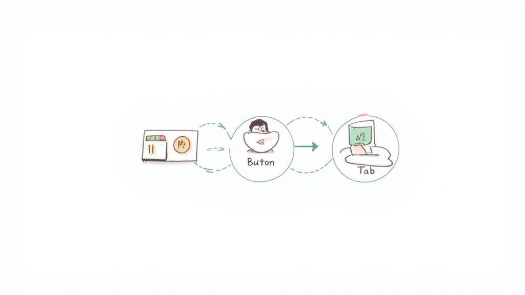
This principle is a cornerstone of WCAG 2.1 AA (Guideline 2.1), ADA, Section 508, AODA, and EN 301 549 compliance. Without it, significant portions of your audience are effectively locked out of your digital experience.
Why It's a Top Priority
Keyboard-only navigation is a critical test because its failure indicates a fundamental barrier to access. If a user cannot reach a "Submit" button or open a dropdown menu without a mouse, they cannot complete their task. Major platforms like GitHub and Microsoft Office 365 excel here, providing comprehensive keyboard shortcuts and intuitive navigation that serve as excellent implementation models.
How to Implement and Test
Follow these actionable steps to ensure your site is keyboard-friendly:
Systematic Testing: Navigate your entire site using only the keyboard. The primary keys to test are Tab (to move forward), Shift+Tab (to move backward), Enter (to activate links/buttons), the Spacebar (to toggle checkboxes/buttons), and the Arrow Keys (for radio buttons and dropdowns).
Visible Focus Indicator: As you tab through elements, there must be a clear visual cue, like a prominent outline or highlight, showing which element is currently active. This is mandated by WCAG 2.4.7 Focus Visible.
Logical Tab Order: The focus order must follow the visual and logical flow of the page, typically from top to bottom and left to right. A disjointed tab order can be confusing and disorienting.
Implement "Skip to Content" Links: For pages with extensive navigation menus, a "skip to content" link should be the first focusable element. This allows keyboard users to bypass repetitive navigation and jump directly to the main content area, greatly improving efficiency.
2. Color Contrast
TL;DR: Text and interactive elements must have sufficient color contrast against their background to be readable for everyone, especially users with low vision or color blindness. Meeting minimum contrast ratios is a fundamental requirement of any comprehensive web accessibility checklist.
Color contrast is the difference in light between the foreground color (like text or an icon) and its background. For content to be accessible, this difference must be significant enough for people with visual impairments, including color blindness, to perceive it clearly. This principle is not about aesthetics; it is about ensuring that crucial information conveyed through text and user interface components is legible for all users.

This standard is a core component of WCAG 2.1 AA (Guideline 1.4.3), which mandates a contrast ratio of at least 4.5:1 for normal text and 3:1 for large text. Failing to meet these ratios can render your content unreadable for a significant portion of your audience, directly impacting usability and compliance with ADA, Section 508, AODA, and EN 301 549.
Why It's a Top Priority
Poor color contrast is one of the most common accessibility failures on the web. It creates immediate barriers for users with low vision, preventing them from reading content, identifying links, or understanding form fields. Organizations like Google, through its Material Design guidelines, and government sites like The White House website, enforce strict contrast requirements, recognizing it as essential for an inclusive user experience. Ensuring strong contrast is a high-impact, low-effort fix that dramatically improves readability.
How to Implement and Test
Follow these actionable steps to ensure your site meets contrast standards:
Use Contrast Checkers: Integrate tools like the WebAIM Contrast Checker or browser extensions like axe DevTools into your design and development workflow. These tools provide instant pass/fail feedback on color pairings.
Check All States: Don't forget to test the contrast of interactive elements in their various states, such as when a button is hovered over or a link receives focus. The contrast must be sufficient in all situations.
Don't Rely on Color Alone: Never use color as the sole means of conveying information, indicating an action, or distinguishing a visual element. For example, supplement a red error message with an icon and explicit text.
Simulate Color Blindness: Use color blindness simulators, available in browser developer tools or as standalone applications, to get a sense of how users with different types of color vision deficiency will perceive your design.
3. Semantic HTML
TL;DR: Use HTML elements according to their meaning, not just for their appearance. Semantic HTML provides a clear structure that assistive technologies can interpret, making your content understandable for everyone. Using elements like <nav>, <main>, and proper headings is a fundamental requirement in any complete web accessibility checklist.
Semantic HTML is the practice of using predefined HTML tags that convey the meaning and structure of the content they contain. Instead of using generic <div> and <span> tags for everything, semantic HTML employs specific elements like <header>, <article>, and <footer> to describe the different parts of a webpage. This creates a logical, machine-readable document outline that screen readers and other assistive technologies can use to provide context and navigation shortcuts to users.
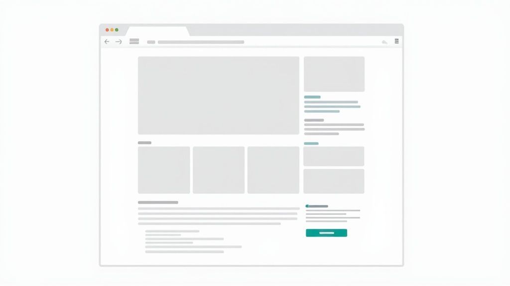
This principle is foundational to WCAG and supports multiple guidelines, including 1.3.1 Info and Relationships and 2.4.6 Headings and Labels. Correct semantic structure is essential for compliance with ADA, Section 508, AODA, and EN 301 549, as it directly impacts how assistive technology interprets your content.
Why It's a Top Priority
Without semantic structure, a webpage is just a collection of text and images to an assistive device. A screen reader user cannot distinguish a main heading from a footer or a navigation menu from the primary content. This lack of context makes navigation difficult and frustrating. Major informational sites like the MDN Web Docs and Wikipedia are excellent examples of semantic HTML in action, using proper heading hierarchies and structural elements to create highly accessible and easily navigable content.
How to Implement and Test
Follow these actionable steps to ensure your code is semantically correct:
Use Landmark Elements: Structure your page with landmark elements like
<header>,<nav>,<main>,<aside>, and<footer>. This allows users to jump directly to key sections of the page.Maintain Heading Hierarchy: Use
<h1>through<h6>to structure your content logically. Start with a single<h1>for the main page title and do not skip heading levels (e.g., do not jump from an<h2>to an<h4>).Use the Right Element for the Job: Use
<button>for actions and<a>for navigation. Wrap lists in<ul>or<ol>with<li>items. Associate form inputs with<label>tags to ensure clarity.Audit Your Code: Regularly review your HTML to replace non-semantic
<div>elements with more appropriate tags where possible. Use validation tools to check for structural errors and ensure your document outline is logical and well-formed.
4. ARIA (Accessible Rich Internet Applications) Labels and Descriptions
TL;DR: Use ARIA (Accessible Rich Internet Applications) attributes to enhance the information available to assistive technologies when standard HTML isn't enough. ARIA roles, states, and properties clarify the purpose and function of dynamic and complex UI components, making your web accessibility checklist more robust.
ARIA is a set of attributes you can add to HTML elements to provide more context for screen reader users and other assistive technologies. While semantic HTML should always be your first choice, ARIA serves as a crucial bridge for complex widgets like custom dropdowns, sliders, or dynamically updated content where native HTML elements fall short. It allows you to define roles (e.g., role="dialog"), properties (e.g., aria-label), and states (e.g., aria-expanded="true") to make interactive elements understandable and operable for everyone.
This practice is essential for meeting WCAG 2.1 AA criteria (Guideline 4.1.2 Name, Role, Value), which requires that all user interface components have names and roles that can be programmatically determined. Without proper ARIA implementation, users of assistive technology may not understand how to interact with custom components.
Why It's a Top Priority
Modern web applications are rich and dynamic, often featuring components that have no direct HTML equivalent. ARIA provides the necessary semantics to make these experiences accessible. Forgetting ARIA is like building a visually beautiful interface with unlabeled controls, leaving a significant portion of your audience unable to use it. Leading platforms like Gmail use ARIA extensively, such as aria-live to announce new email notifications, and Google Maps uses it for its complex interactive controls.
How to Implement and Test
Follow these actionable steps to correctly apply ARIA to your components:
Prioritize Semantic HTML: The first rule of ARIA is not to use ARIA. If a native HTML element like
<button>or<nav>already provides the needed semantics, use it instead.Test with Screen Readers: The only way to truly validate your ARIA implementation is to test it with actual screen readers like NVDA, JAWS, or VoiceOver. Ensure the announcements are clear, concise, and match the UI's state.
Use
aria-labelfor Clarity: Applyaria-labelto provide a concise, accessible name when no visible text label exists. For example, use<button aria-label="Close">X</button>for an icon-only button.Manage Dynamic Content: Use
aria-liveregions to inform users of important changes on the page, like form submission confirmations or error messages, without shifting their focus.Consult WAI-ARIA Authoring Practices: When building complex components like modals, tabs, or carousels, refer to the WAI-ARIA Authoring Practices Guide for proven design patterns and keyboard interaction models.
5. Alt Text for Images
TL;DR: All meaningful images must have descriptive alternative (alt) text that conveys their content and function. This critical component of any web accessibility checklist ensures users with visual impairments can understand visual information and also benefits SEO and users with slow connections.
Alternative text, or alt text, is a written description of an image that is read aloud by screen readers. It serves as a direct replacement for visual content when an image cannot be seen, whether due to a user's disability, a slow internet connection, or browser settings that block images. Providing clear and contextual alt text ensures that no user misses out on important information conveyed visually.
This practice is a fundamental requirement of WCAG 2.1 AA (Guideline 1.1.1 Non-text Content), making it essential for ADA, Section 508, AODA, and EN 301 549 compliance. Without it, the visual elements of your website become inaccessible barriers.
Why It's a Top Priority
Images are often central to conveying information, from product photos to informational charts. If this content is not described, screen reader users receive an incomplete and often confusing experience. Leading content platforms like Wikipedia and The New York Times demonstrate best practices by providing detailed, context-aware alt text for their imagery, ensuring their stories are accessible to everyone.
How to Implement and Test
Follow these actionable steps to write effective alt text for your images:
Describe Content and Function: The text should accurately describe what the image contains and, if it's a link or button, what it does. Avoid redundant phrases like "image of" or "picture of" as screen readers already announce it as an image.
Be Concise yet Descriptive: Aim for a brief but thorough description. Convey the essential information without overwhelming the user. For a deep dive into crafting effective descriptions, you can learn more about quality alt text on webability.io.
Use Null Alt Text for Decoration: For images that are purely decorative and provide no informational value (e.g., background patterns, stylistic borders), use an empty alt attribute (
alt=""). This signals screen readers to skip the image entirely, preventing unnecessary noise.Address Complex Images: For charts, graphs, or detailed infographics, a short alt text description is insufficient. Provide a brief summary in the alt text and include a longer, more detailed description in the page content nearby or in a linked document.
Test Your Implementation: A simple way to test is to disable images in your browser and see if the page content still makes sense. You can also use a screen reader to listen to how your alt text is announced.
6. Form Labels and Input Identification
TL;DR: Every form input must have a programmatically associated label. This foundational practice in our web accessibility checklist ensures users of assistive technologies can understand and correctly complete forms, preventing confusion and submission errors. Placeholder text alone is never an acceptable substitute for a proper label.
Form accessibility hinges on clearly identifying the purpose of each input field. Users, particularly those relying on screen readers, need to know what information is expected for every text box, checkbox, and radio button. This is achieved by programmatically linking a visible <label> element to its corresponding <input> using the for and id attributes. This direct association allows screen readers to announce the label when the user focuses on the input, providing critical context.

This principle is a core requirement of WCAG 2.1 AA (Guideline 3.3.2), as well as ADA, Section 508, AODA, and EN 301 549 compliance. Properly labeled forms are the difference between a seamless transaction and a dead end for many users.
Why It's a Top Priority
Unlabeled or improperly labeled form fields are a major barrier to accessibility. Without clear labels, users cannot be certain what data to enter, leading to errors, frustration, and abandonment. This directly impacts conversions, sign-ups, and customer support interactions. Websites like Gov.uk and platforms such as Mailchimp and Typeform set a high standard with forms that feature excellent label design, clear instructions, and intuitive navigation.
How to Implement and Test
Follow these actionable steps to ensure your forms are accessible:
Use the
<label>Element: Always use the<label>element with theforattribute, linking it to theidof the corresponding<input>. Placeholder text can be a supplementary hint, but never the primary label.Group Related Fields: For related inputs like a series of checkboxes or radio buttons, group them within a
<fieldset>element and provide a clear overall description using a<legend>element.Indicate Required Fields: Use the
requiredattribute oraria-required="true"to programmatically indicate which fields are mandatory. A visual cue, like an asterisk, should also be present.Associate Error Messages: If a validation error occurs, programmatically link the error message to the input field using
aria-describedby. This ensures screen readers announce the error when the user focuses on the invalid field.Test with Assistive Technology: Navigate your forms using only a keyboard and a screen reader (like NVDA or VoiceOver). Confirm that every input's label is announced correctly and that you can understand all instructions and error states.
7. Heading Hierarchy and Structure
TL;DR: Organize all page content using a logical heading structure (H1 through H6). A proper hierarchy provides a clear content outline, enabling screen reader users to understand the page's organization and navigate efficiently to specific sections. One <h1> per page is a foundational rule.
Heading hierarchy is the practice of using HTML heading tags (<h1>, <h2>, <h3>, etc.) to structure content semantically. More than just making text larger or bold, these tags create a machine-readable outline of your page. For users of assistive technologies like screen readers, this outline is essential for understanding the relationship between different content sections and for quickly jumping to the information they need.
This principle is a core component of a comprehensive web accessibility checklist and directly supports WCAG 2.1 AA (Guideline 2.4.6 Headings and Labels and 1.3.1 Info and Relationships). Without a logical heading structure, a page can feel like a flat wall of text to a screen reader user, making navigation difficult and frustrating.
Why It's a Top Priority
A logical heading structure is the primary way screen reader users skim a webpage, much like a sighted user scans visual headings to find relevant information. Skipping heading levels or using them purely for styling breaks this navigational structure, creating a significant barrier to access. Major content-rich sites like the BBC and Apple’s documentation pages are excellent models, using a strict and logical heading order to organize complex information effectively.
How to Implement and Test
Follow these actionable steps to ensure your site's heading structure is accessible:
Single
<h1>: Use one, and only one,<h1>per page. This tag should represent the main title or primary purpose of the page.Sequential Order: Do not skip heading levels. The hierarchy must progress logically (e.g., an
<h2>should be followed by an<h3>, not an<h4>). Think of it as creating a document outline.Use Headings for Structure, Not Style: Never choose a heading tag based on its default appearance. If you need text to be larger or bold, use CSS classes instead. Headings must describe the content that follows.
Screen Reader Testing: Use a screen reader (like NVDA or VoiceOver) to navigate your page using only headings. This will quickly reveal any issues with the logical flow or structure.
Developer Tools: Most browser developer tools have features or extensions (like the "Accessibility" tab in Chrome DevTools or the WAVE browser extension) that can display the document outline created by your headings, making it easy to spot errors.
8. Focus Management and Visible Focus Indicators
TL;DR: Every interactive element must have a clear visual indicator when it receives keyboard focus, and that focus must move logically through the page. This part of our web accessibility checklist is crucial for keyboard-only users to understand their location and navigate effectively, especially in dynamic applications.
Focus management is the practice of controlling where the user's focus is on a webpage at all times, while a visible focus indicator is the visual highlight that shows which element is currently active. For keyboard and screen reader users, the focus indicator is their equivalent of a mouse cursor; without it, they are navigating blind. Proper management ensures that focus moves predictably and is intentionally placed when elements like modals or pop-ups appear.
This principle is a core requirement for WCAG 2.1 AA compliance, specifically under Guideline 2.4.7 Focus Visible and 2.4.3 Focus Order. Failing to manage focus properly can render a site unusable for anyone not using a mouse, directly impacting ADA, Section 508, AODA, and EN 301 549 adherence.
Why It's a Top Priority
A missing or unclear focus indicator is a major accessibility barrier. If users cannot see where they are on the page, they cannot confidently interact with its content. Similarly, if focus is not managed correctly when a modal dialog opens, a keyboard user might still be tabbing through elements on the page behind it. Excellent examples of this in practice include GitHub's prominent blue focus outlines and the Google Material Design system, which defines clear and consistent focus states for all interactive components.
How to Implement and Test
Follow these actionable steps to ensure robust focus visibility and management:
Never Remove Default Outlines: The most common mistake is disabling the browser's default focus indicator (e.g.,
outline: none;) without providing a better, high-contrast alternative. Always ensure a replacement is in place if you customize this.Manage Focus in Dynamic Components: When a modal, dialog, or non-modal window opens, programmatically move focus to the first interactive element within it. When it closes, return focus to the element that originally triggered it.
Test the Focus Order: Use the Tab and Shift+Tab keys to navigate. The focus order must follow the visual and logical flow of the content. Any unexpected jumps or traps indicate a failure in the document object model (DOM) order.
Ensure High Contrast: The focus indicator must have sufficient contrast against the background to be easily perceivable by users with low vision. Use tools to check that your focus styling meets contrast ratio requirements.
Add Visual Spacing: Use CSS properties like
outline-offsetto add a small space between the element and its focus indicator. This prevents the outline from being obscured by the element's border and improves clarity.
9. Text Alternatives for Non-Text Content
TL;DR: All non-text content, including images, icons, charts, and multimedia, must have a text alternative. This core component of any web accessibility checklist ensures that information conveyed visually or audibly is equally available to users with visual or hearing impairments. This includes alt text for images, transcripts for audio, and captions for video.
Providing text alternatives means creating a text-based equivalent for any content that is not text itself. For users who are blind and rely on screen readers, this text is read aloud, describing what an image contains or what is happening in a video. For those who are deaf or hard of hearing, captions and transcripts make audio and video content accessible. Without these alternatives, essential information and context are lost, creating significant barriers.
This principle is a foundational element of WCAG 2.1 AA (Guideline 1.1), ADA, Section 508, AODA, and EN 301 549 compliance. It guarantees that no user is excluded from understanding the full scope of your content simply because of the format in which it is presented.
Why It's a Top Priority
Failing to provide text alternatives renders visual and audio content completely inaccessible to certain groups of users. An infographic explaining a critical process is useless to a screen reader user without a descriptive text equivalent. Platforms like NPR, which provides full transcripts for its audio stories, and YouTube, with its robust captioning system, are excellent models of how to integrate text alternatives effectively, making their content universally accessible.
How to Implement and Test
Follow these actionable steps to provide effective text alternatives:
Meaningful Alt Text: All informative images must have descriptive
alttext that conveys the same message as the image. Decorative images should have an emptyalt=""attribute to be ignored by screen readers.Captions and Transcripts: Provide synchronized captions for all video content with audio. Additionally, offer a full text transcript for both audio and video content, which benefits users with hearing impairments and those who prefer to read.
Audio Descriptions: For videos where important visual information is not conveyed through the main audio track, provide a separate audio description track that narrates these visual cues.
Complex Images: For complex images like charts, graphs, and infographics, provide a detailed text description or a data table on the page that presents the same information.
Testing: Use a screen reader to navigate your site and ensure all non-text elements announce their text alternatives clearly and accurately. Verify that captions are synchronized and transcripts are complete.
10. Language and Content Clarity
TL;DR: Content must be written in clear, simple language to be understood by the widest possible audience. Avoiding jargon, complex sentences, and unnecessary complexity is a key part of any web accessibility checklist, ensuring information is accessible to users with cognitive disabilities, limited literacy, or those who are non-native speakers.
Language and content clarity is the practice of presenting information in a way that is easy to read, understand, and use. This involves using plain language, organizing content logically, and avoiding overly technical terms or convoluted sentence structures. Accessibility is not just about technical implementation; it extends to the very words on the page, ensuring that the message itself does not create a barrier for users.
This principle is a core component of WCAG 2.1 AA (Guideline 3.1), which emphasizes making text content readable and understandable. Without clear communication, even a technically perfect website can fail to serve its users, rendering its features and information useless to a significant portion of the audience.
Why It's a Top Priority
Confusing or complex content can be just as exclusionary as a missing alt tag or a non-functional keyboard link. Prioritizing clarity ensures your message reaches everyone, reduces user frustration, and improves overall usability. The NHS UK website is an excellent model, using simplified, direct language to explain complex health topics, while Apple's product pages use minimal, clear descriptions to communicate features effectively. For more details on this topic, learn more about cognitive accessibility in the digital age.
How to Implement and Test
Follow these actionable steps to improve the clarity of your website's content:
Use Plain Language: Write in a clear, concise style. Use the active voice instead of the passive voice, and choose common words over complex ones. Aim for a reading level that is appropriate for a broad audience.
Structure for Readability: Break up long blocks of text with short sentences and paragraphs. Use headings, subheadings, bullet points, and numbered lists to organize information logically and make it easier to scan.
Define Jargon and Acronyms: If technical terms or acronyms are unavoidable, define them clearly upon their first use. Consider providing a glossary for highly specialized content.
Use Readability Tools: Utilize tools like the Hemingway App or Grammarly to assess your content's complexity. These tools can identify long sentences, passive voice, and difficult words, helping you simplify your writing.
Test with Real Users: The best way to know if your content is clear is to test it with your target audience, including individuals with cognitive disabilities. Their feedback is invaluable for identifying areas of confusion.
10-Point Web Accessibility Checklist Comparison
| Accessibility Feature | Implementation complexity | Resource requirements | Expected outcomes | Ideal use cases | Key advantages |
|---|---|---|---|---|---|
| Keyboard Navigation | Medium — tabindex, focus management, some JS | Developer time, keyboard & screen reader testing | Full keyboard operability; WCAG A compliance | Interactive apps, forms, SPAs, power-user workflows | Enables keyboard-only use; aids motor/screen-reader users |
| Color Contrast | Low — design adjustments and checks | Designer time, contrast tools, QA | Improved readability and visual hierarchy; WCAG AA | Content-heavy sites, branding updates, mobile UIs | Better readability for low-vision users; simple wins |
| Semantic HTML | Low–Medium — refactor markup and templates | Dev time, code reviews, linters | Clear document structure; better assistive tech parsing and SEO | Blogs, documentation, content sites, CMS-driven pages | Improves accessibility/maintainability; reduces ARIA need |
| ARIA Labels & Descriptions | High — careful, contextual ARIA use and maintenance | Dev time, screen-reader testing, ongoing upkeep | Accessible complex widgets and dynamic content | Custom controls, maps, interactive widgets, rich web apps | Adds contextual info where semantic HTML falls short |
| Alt Text for Images | Low — authoring alt for each image | Content writers, editorial review, QA | Accessible images for screen readers; SEO improvement | News, e-commerce, educational content, galleries | Essential for screen-reader users; supports SEO and fallback |
| Form Labels & Input Identification | Low–Medium — correct labels and associations | Dev time, testing with assistive tech | Clear form understanding; fewer errors and abandonments | Signup, checkout, government and healthcare forms | Improves form usability for screen readers and mobile |
| Heading Hierarchy & Structure | Low — content authoring discipline | Content editors, CMS templates, audits | Logical outline for navigation and scanning; SEO gains | Long articles, documentation, knowledge bases | Enables fast navigation and comprehension via headings |
| Focus Management & Visible Focus Indicators | Medium–High — CSS + JS for complex flows | Dev & QA, keyboard testing, design alignment | Predictable focus behavior and visible focus cues | SPAs, modal-heavy interfaces, complex interactions | Critical for keyboard users; reduces navigation confusion |
| Text Alternatives for Non-Text Content | Medium — captions, transcripts, descriptions | Transcription/caption services, content team effort | Accessible multimedia; supports deaf/blind users and indexing | Video/audio platforms, e-learning, newsrooms | Makes time-based media accessible; improves discoverability |
| Language & Content Clarity | Medium — rewriting and editorial process | Writers, editors, readability testing, user testing | Lower cognitive load; broader comprehension and engagement | Public info, health, legal, instructional content | Benefits cognitive accessibility and non-native speakers |
Putting It All Together: Your Path Forward
Navigating the landscape of digital inclusion can seem complex, but this comprehensive web accessibility checklist provides a clear, actionable roadmap. By methodically addressing each of the ten core areas we've detailed, from foundational semantic HTML to the nuances of ARIA labels and focus management, you are not just ticking boxes. You are fundamentally reshaping your digital presence to welcome every user, regardless of their abilities.
This journey transforms accessibility from an abstract concept into a tangible set of development practices. We've moved beyond generic advice, offering specific code snippets, practical examples, and clear directives to empower your team. The goal is to embed these principles directly into your workflow, making accessibility a proactive standard, not a reactive fix.
From Checklist to Culture: The Real Goal
A completed checklist is a milestone, not a final destination. The true objective is to foster a culture of accessibility within your organization. This means that every designer, developer, content creator, and project manager understands their role in building and maintaining an inclusive experience. Accessibility should be a key consideration from the initial wireframe to the final deployment and beyond.
Remember the core principles we've covered:
Perceivability: Ensuring users can perceive all information, which is why alt text for images and clear color contrast are non-negotiable.
Operability: Making sure all functionality is available through various means, a principle directly supported by robust keyboard navigation and logical heading structures.
Understandability: Creating content and navigation that is clear and predictable, highlighted by our focus on form labels, content clarity, and consistent structure.
Robustness: Building a site that works reliably across different technologies, including assistive ones, which is where clean semantic HTML and proper ARIA implementation become critical.
When these principles guide your digital strategy, you create experiences that are not only compliant but also more intuitive and user-friendly for everyone. This proactive approach significantly reduces long-term maintenance costs and minimizes the legal risks associated with non-compliance with standards like the ADA, Section 508, and WCAG.
Your Actionable Next Steps
Feeling empowered is one thing; putting it into practice is another. Here’s how to build momentum and turn this knowledge into lasting change:
Start with an Audit: Use this web accessibility checklist to conduct a thorough manual audit of your most critical user journeys, such as the checkout process, contact forms, or key landing pages.
Prioritize High-Impact Fixes: Begin with the "low-hanging fruit" that offers the greatest benefit to users. Issues like missing alt text, poor color contrast, and illogical heading order are often the quickest to fix and have an immediate positive impact.
Integrate and Educate: Share this guide with your entire team. Incorporate these checks into your development sprints, quality assurance testing, and content creation guidelines. Continuous education is the key to preventing new accessibility barriers from being introduced.
Leverage a Hybrid Approach: Combine manual testing with automated tools. Automated scanners can quickly identify widespread issues like contrast errors, while manual testing is essential for verifying keyboard navigation, screen reader experience, and overall usability. For those looking to ensure their website adheres to all best practices, including accessibility, consider partnering with professional web design services.
Embracing this checklist is more than a technical exercise; it's a strategic business decision. It opens your brand to the estimated one billion people worldwide who live with a disability, a market with significant purchasing power and a deep appreciation for brands that prioritize their needs. An accessible website enhances your brand reputation, improves SEO, and delivers a superior user experience that benefits your entire audience.
Ready to move from a manual checklist to a streamlined, automated, and comprehensive accessibility solution? WebAbility.io provides an all-in-one platform that combines powerful automated scanning, an intelligent accessibility widget, and expert-led audit services to help you achieve and maintain compliance effortlessly. Discover how WebAbility.io can help you build a more inclusive digital world by visiting WebAbility.io today.
Quick Questions
Tap to ask AI about this article